BILL illustrations
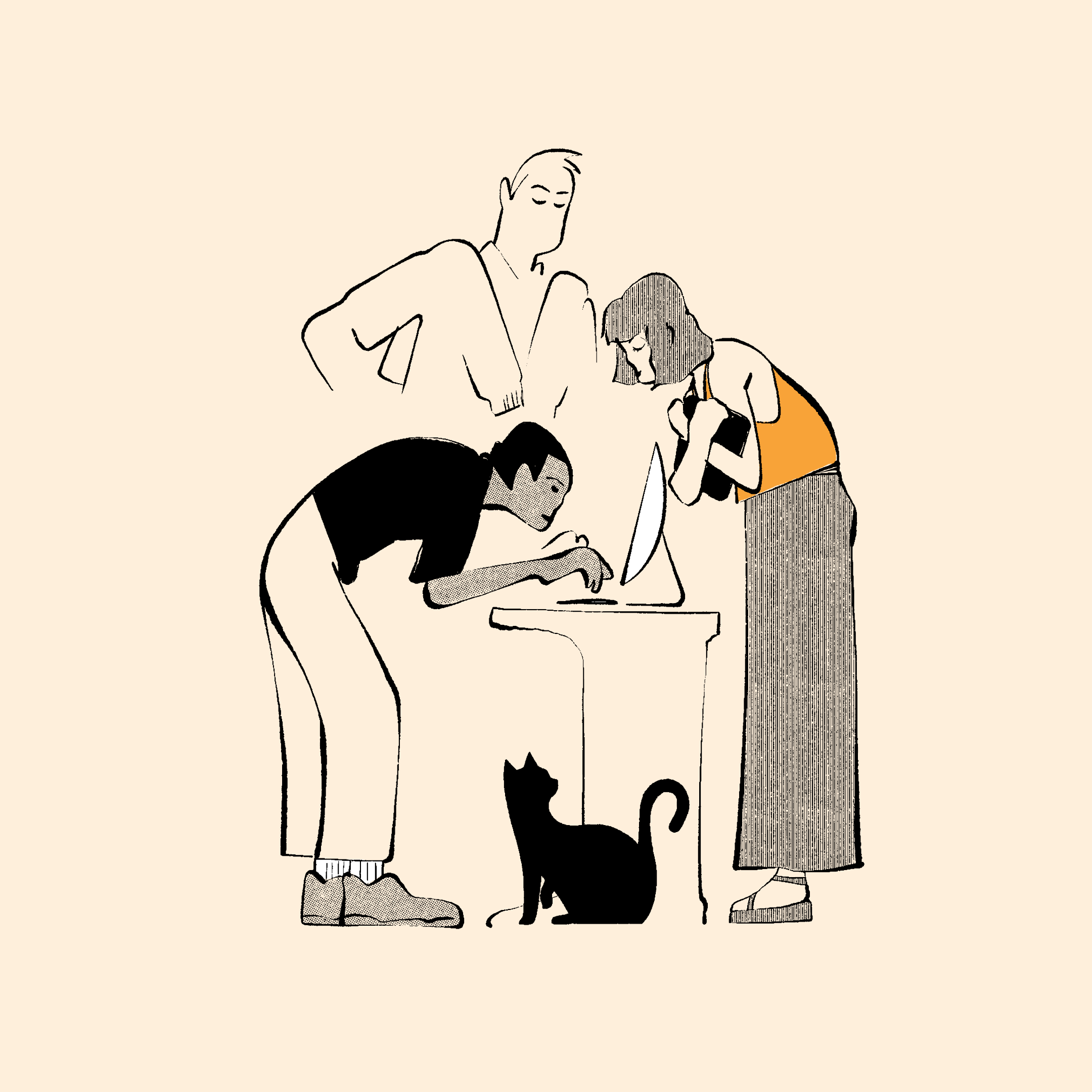
Bill.com rebranded to BILL in 2022. My main contribution to the rebrand was their revitalized illustration style.


Basics
The goal of the refresh was to create an illustration style that felt timeless, human, and uniquely BILL. Within their space, the aesthetic for illustration styles was overwhelmingly homogenous. This gave a lot of opportunity to approach something that could add delight and clarity, feel more like artwork and less like clipart, and evoke a feeling that could be ownable for the brand.


Aesthetics
I referenced the charm that comes from editorial illustration - handmade, black ink, and not entirely perfect. The imagery was meant to evoke a slice of life, steering away from only financial content and instead relying on metaphor to explain concepts. So, we had scenes of individuals in metropolitan areas making purchases to connect to transactions and other scenarios relative to our space. We wanted to focus on people, not things.


Preserving integrity
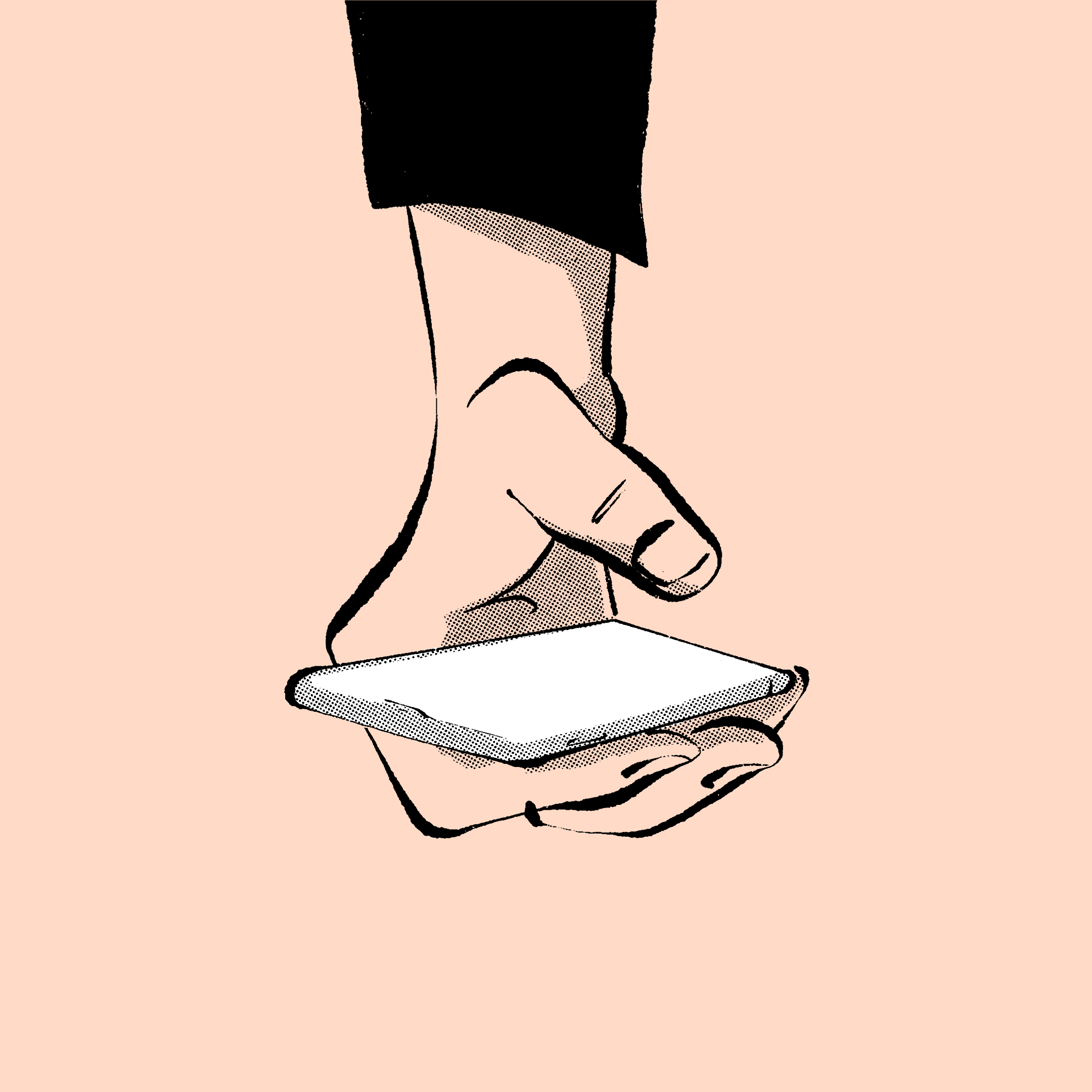
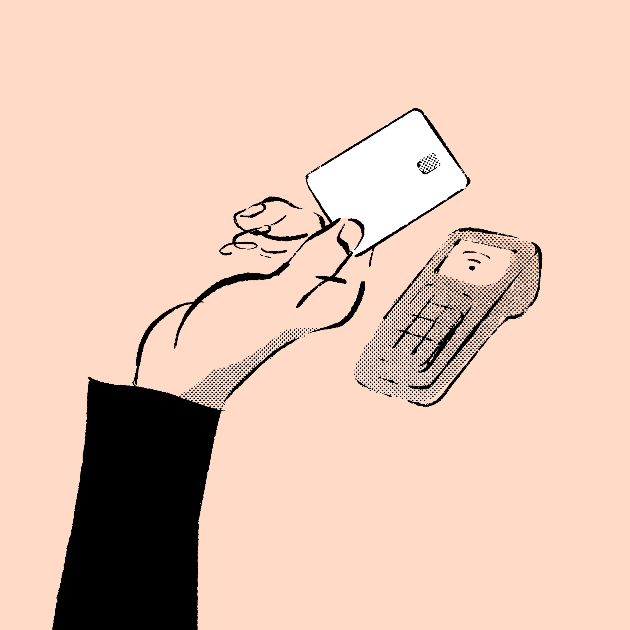
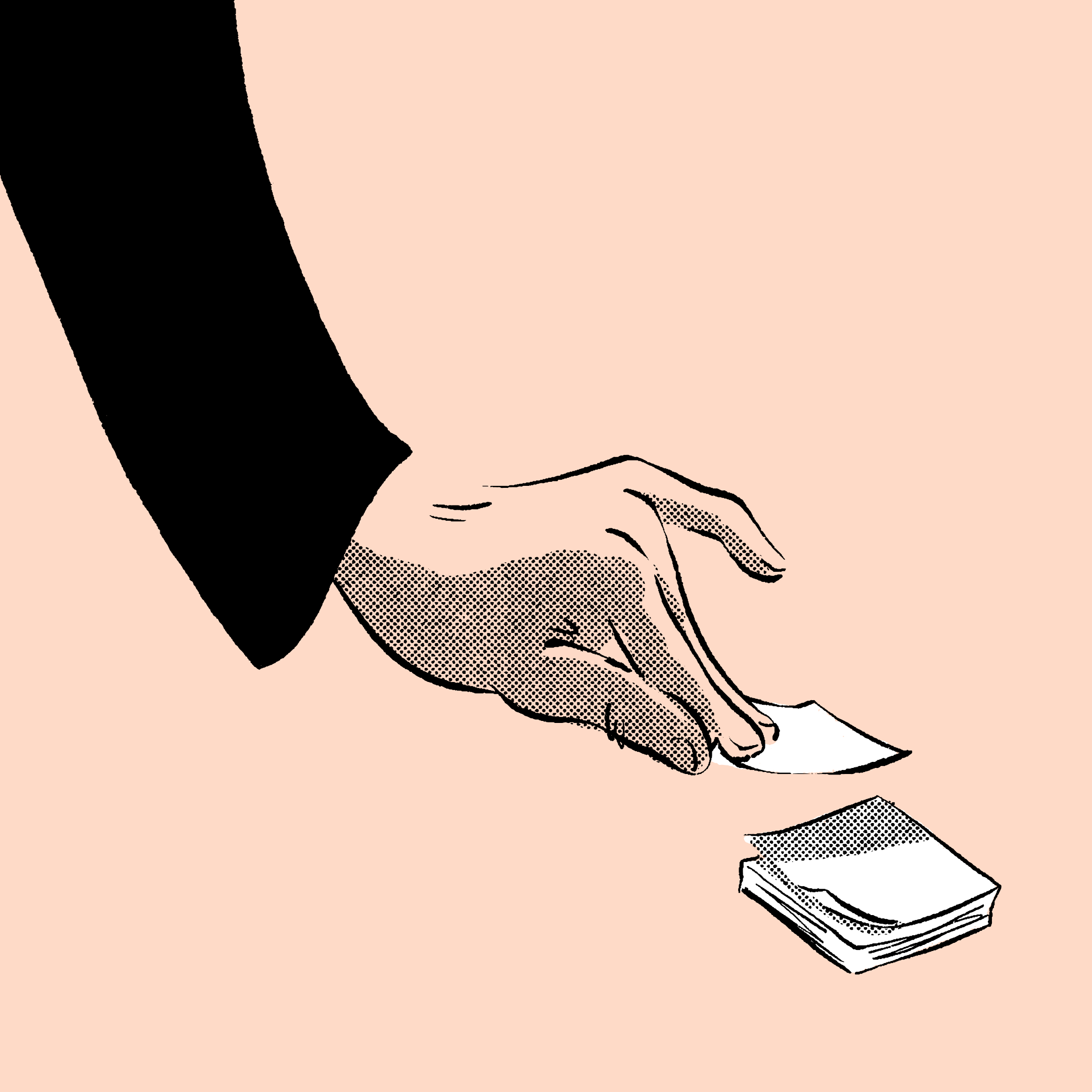
In an effort to feel timeless, we implemented different brand guidelines. Too often are illustrations used as “filler” for designs, and so we created an 80/20 rule with photo and product imagery being used more often. This caused us to up our quality of photography and product imagery. We also made a rule around accurate sizing of illustrations on screen to avoid it feeling like clipart and instead to regard it as a piece of art on screen. More on this to come as the brand develops.