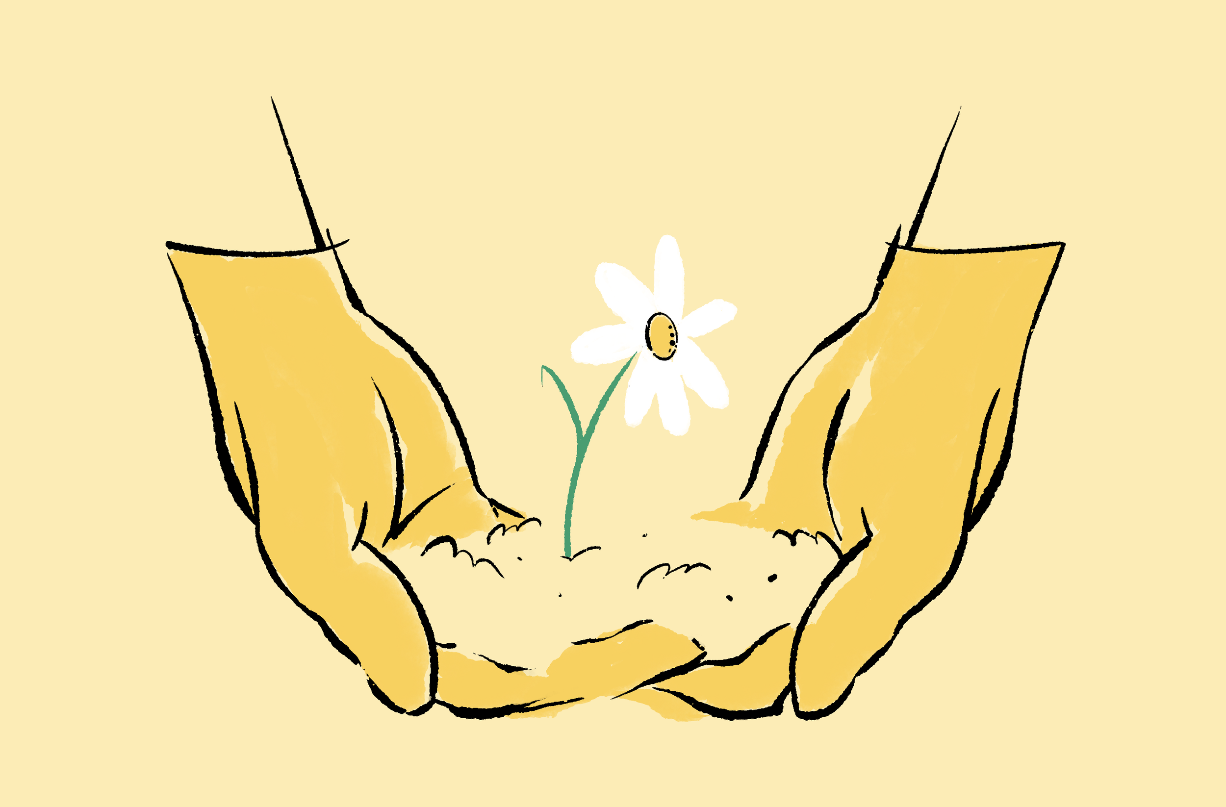
Divvy was my first big experience as an artist/designer. I’ll slowly bring all of this work into this archive to be buried by the internet. But it’s bittersweet.
Divvy was my first big experience as an artist/designer. I’ll slowly bring all of this work into this archive to be buried by the internet. But it’s bittersweet.

I’m pretty sure this project was canned. Last year sometime I created a set of illustrations that weren’t ever picked up by the client. They sorta disappeared off the face of the earth. So you could say these images are evidence that they once existed. Maybe. In a court of law. I’m not an expert. Anyways.


Ok, messy stream of conscious writing here.
So, Dall-e allows you to put in 50 prompts every 24 hrs. I tried to focus my efforts in one direction this time. Also, the more descriptive the better, but it’s definitely a balancing act. Where the adjectives in the phrase are used can be a toss up. For example, using the word “neon” will almost always imply a neon light, as opposed to neon coloring. So you have to then describe a material more and specify, “neon colored paint” vs “neon liquid”. It’ll make more sense if you look at the images.
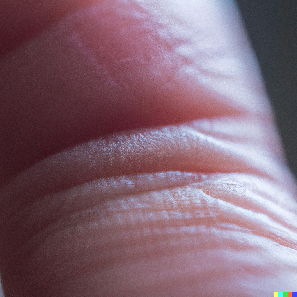
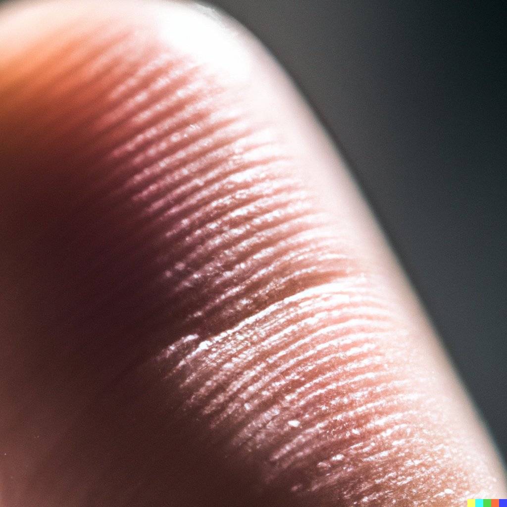
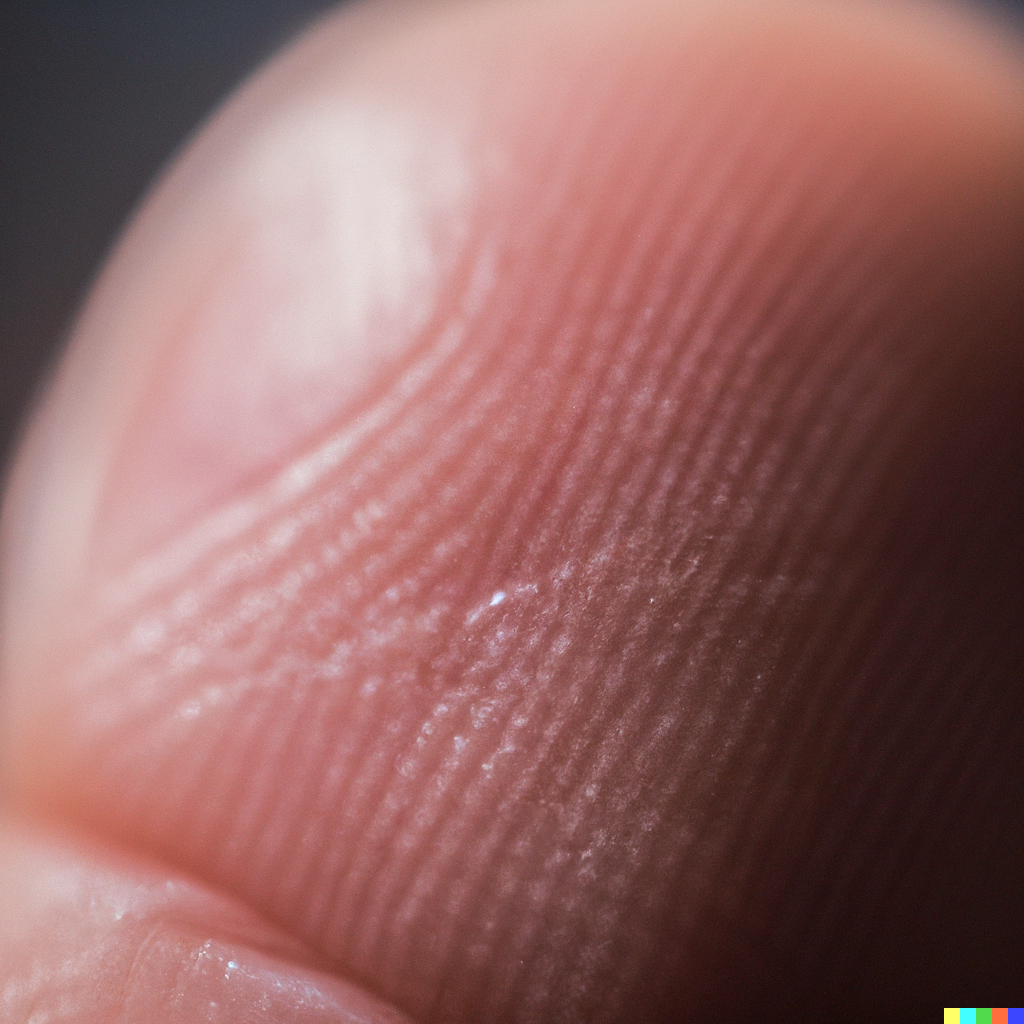
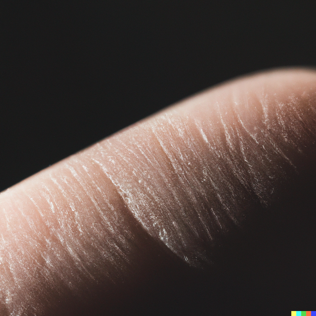
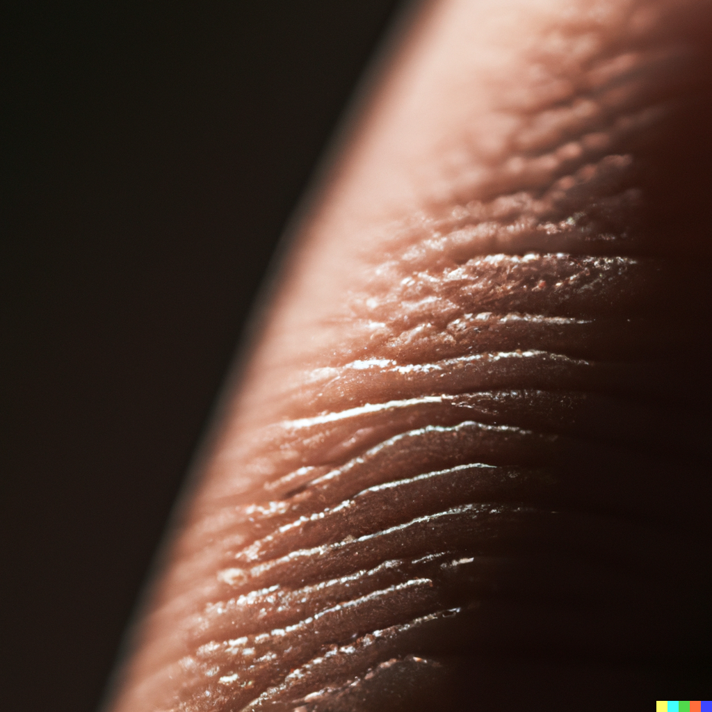
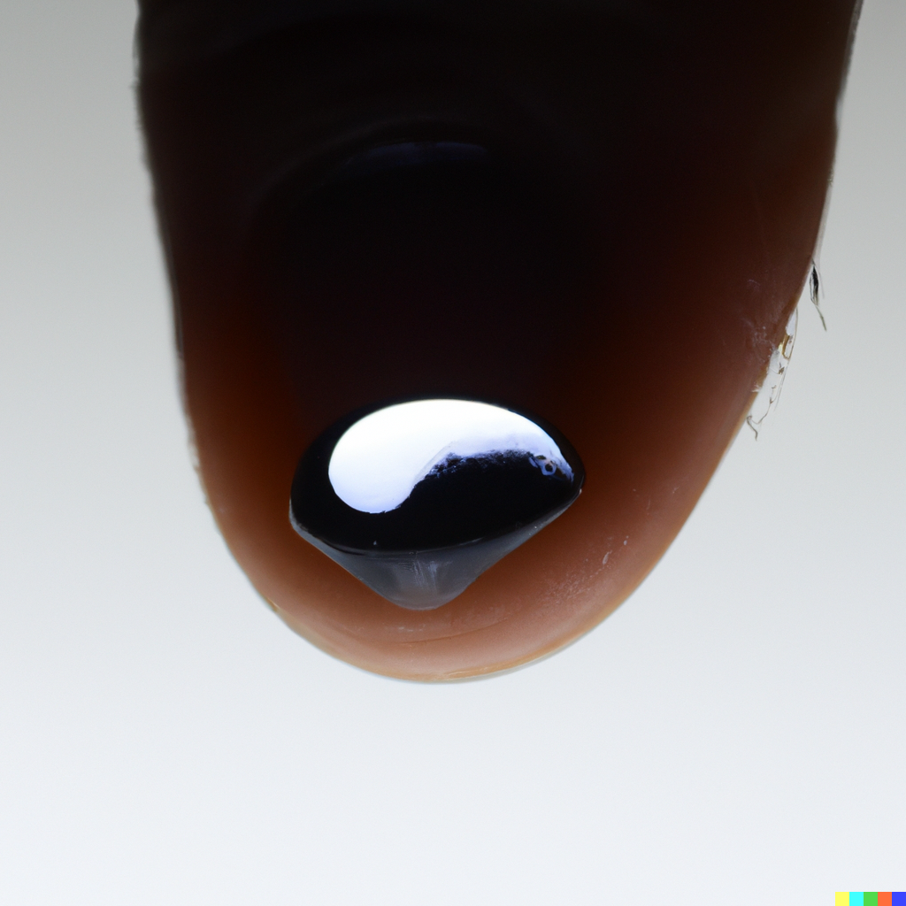
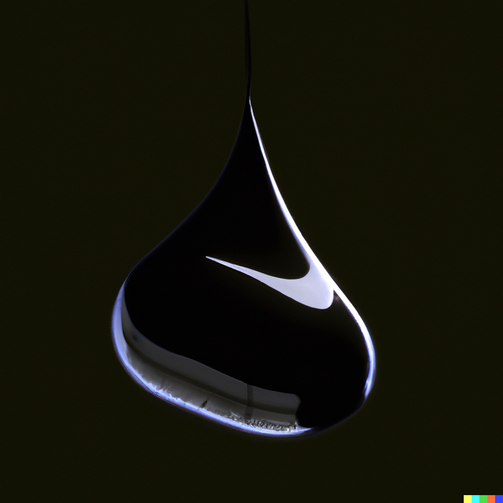
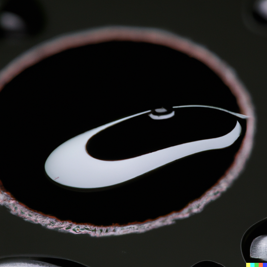
Anyways, I had this image in my mind from the movie Prometheus of a close on the character David’s finger with a drop of liquid on it. There’s a logo inscribed in his finger print too. That was in my mind when I started this. So I tried to develop the finger tip image first and then moved on from there.
So, here are my prompts and then the images generated below them:
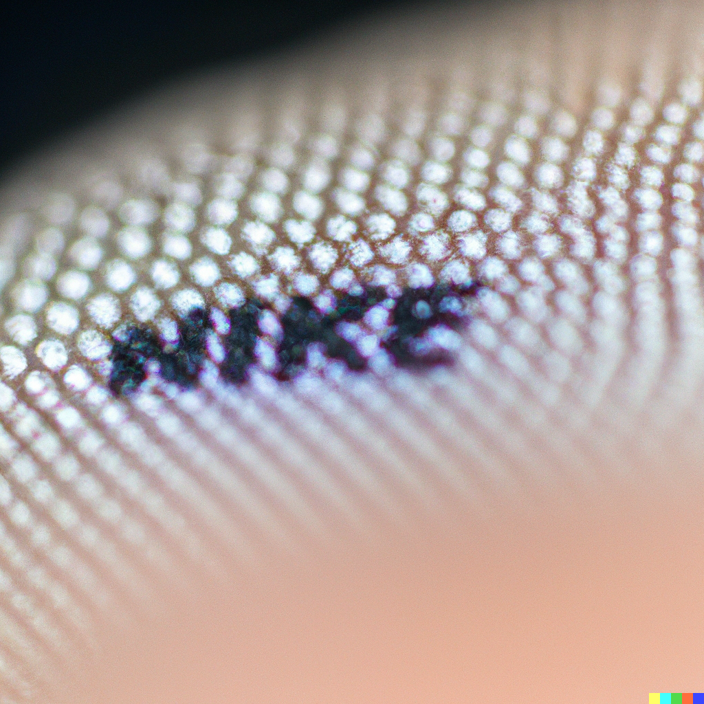
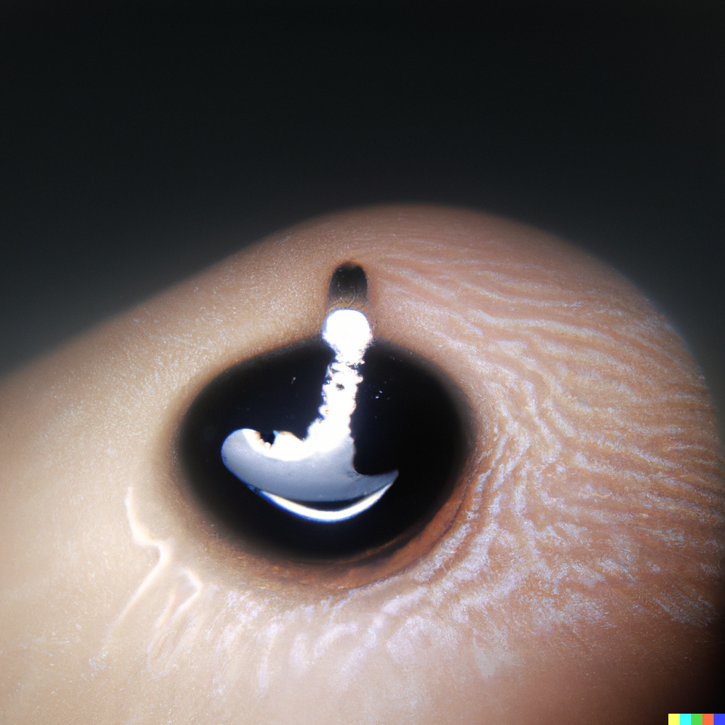
Close up macro photo of finger tip, Close up macro photo of finger tip, dramatic lighting
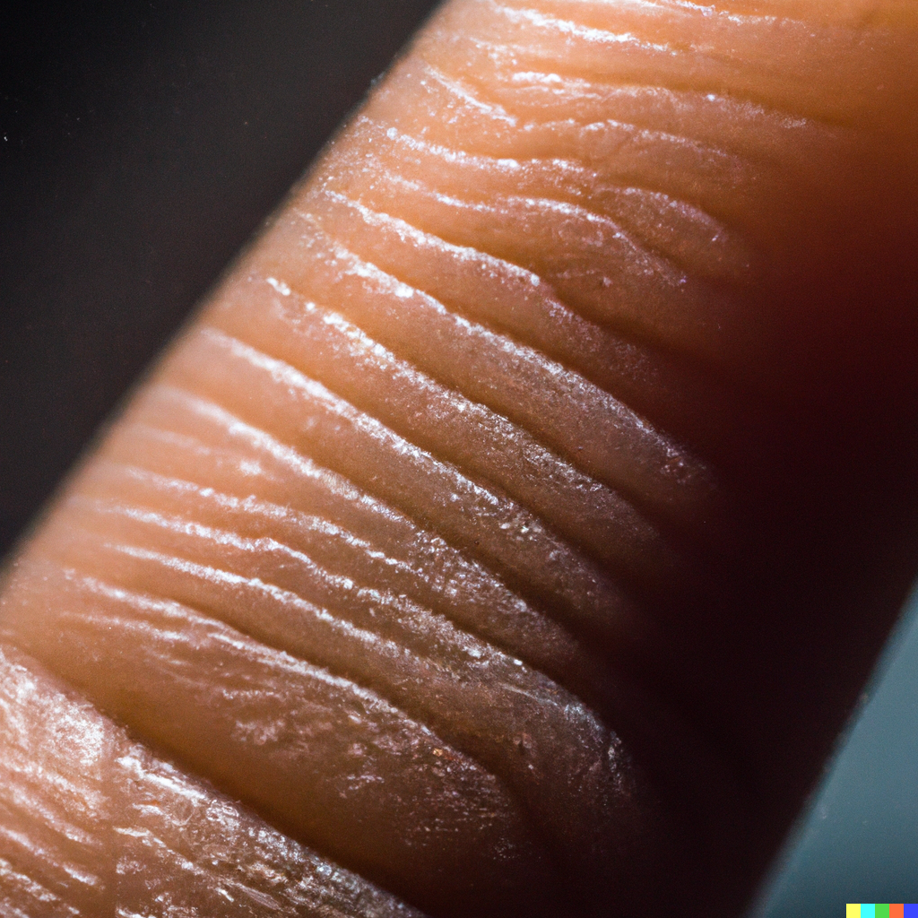
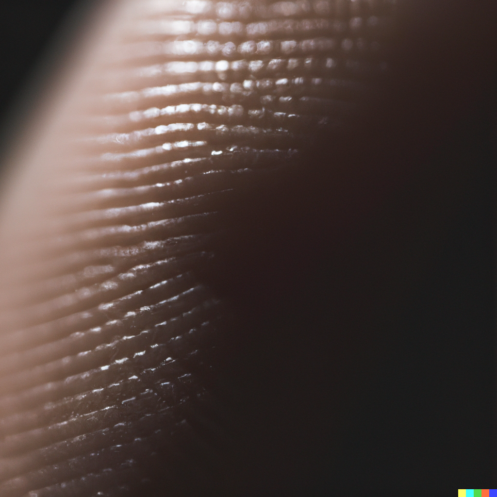
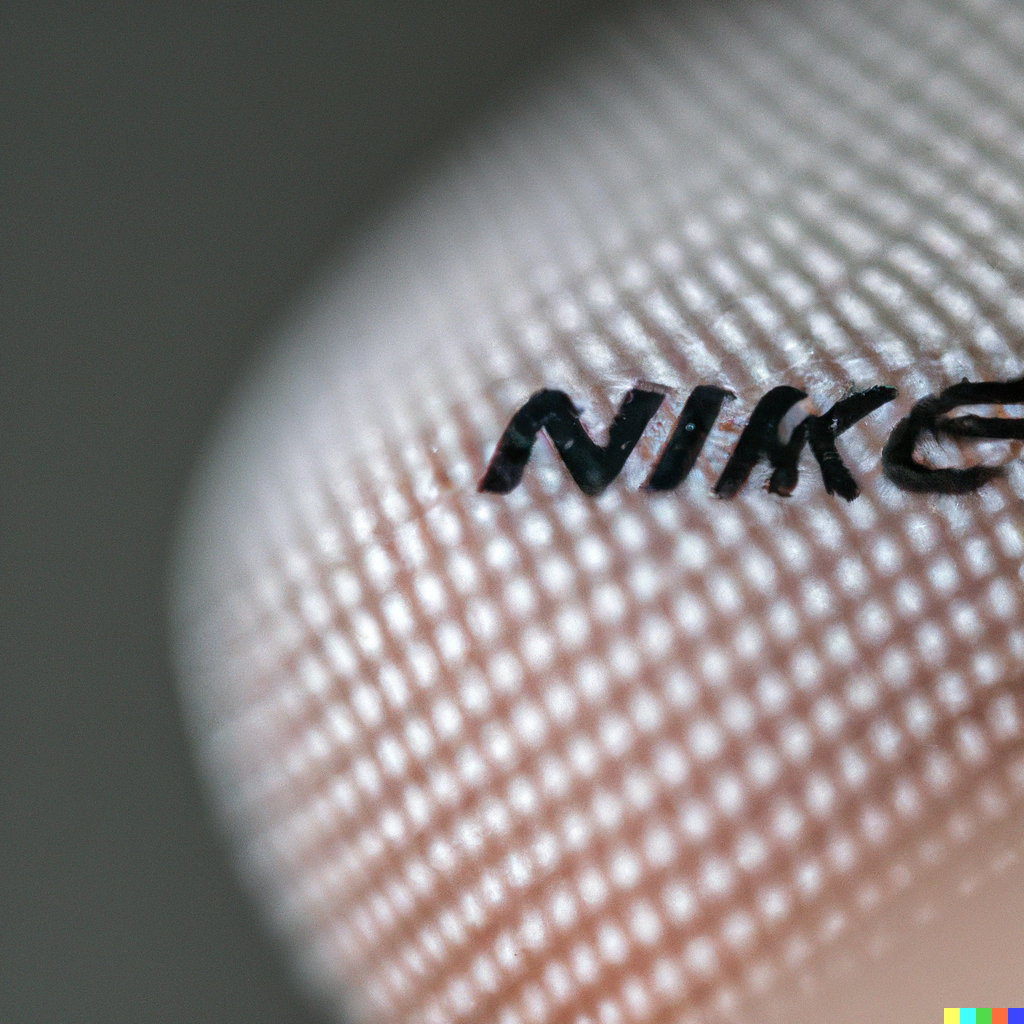
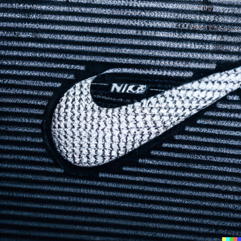
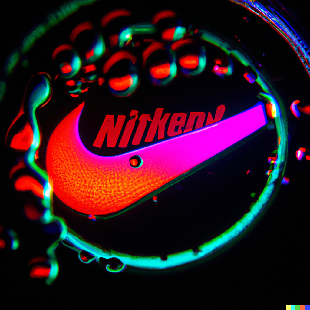
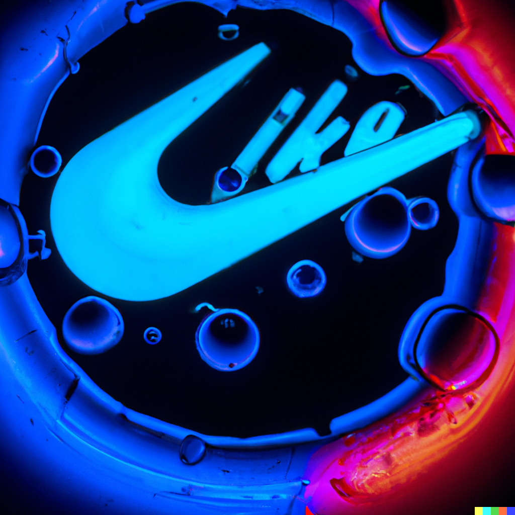
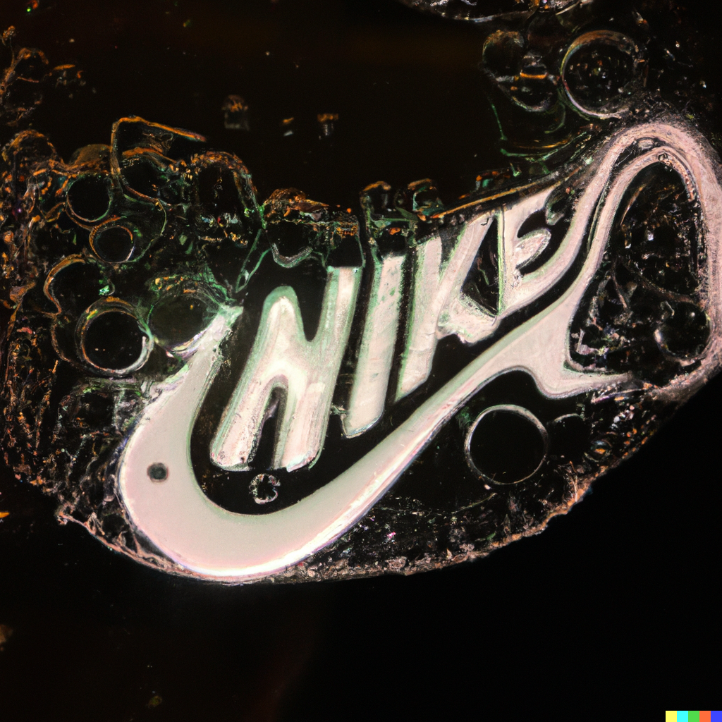
Close up macro photo of finger tip, dramatic lighting, with nike logo
Close up macro photo of finger tip with nike logo
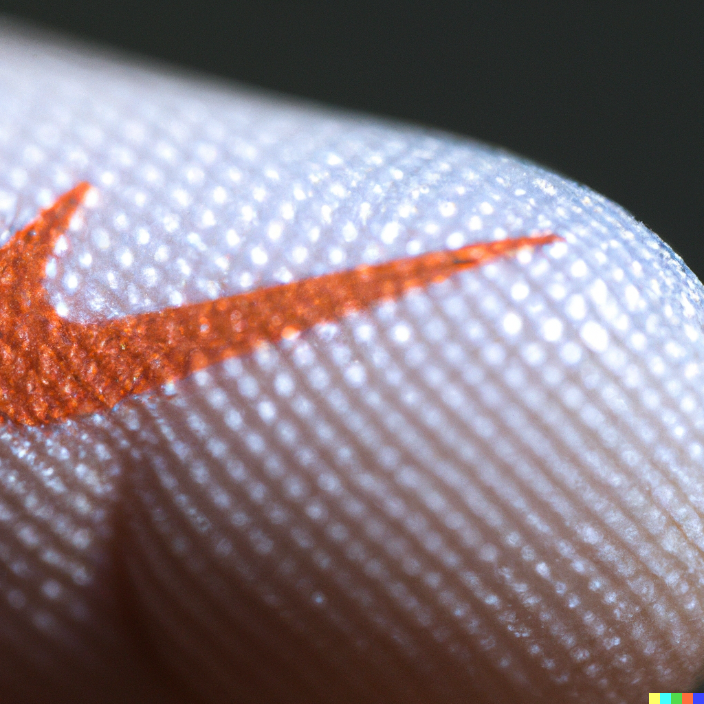
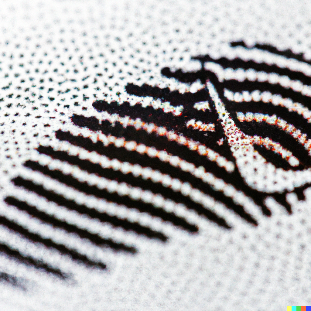
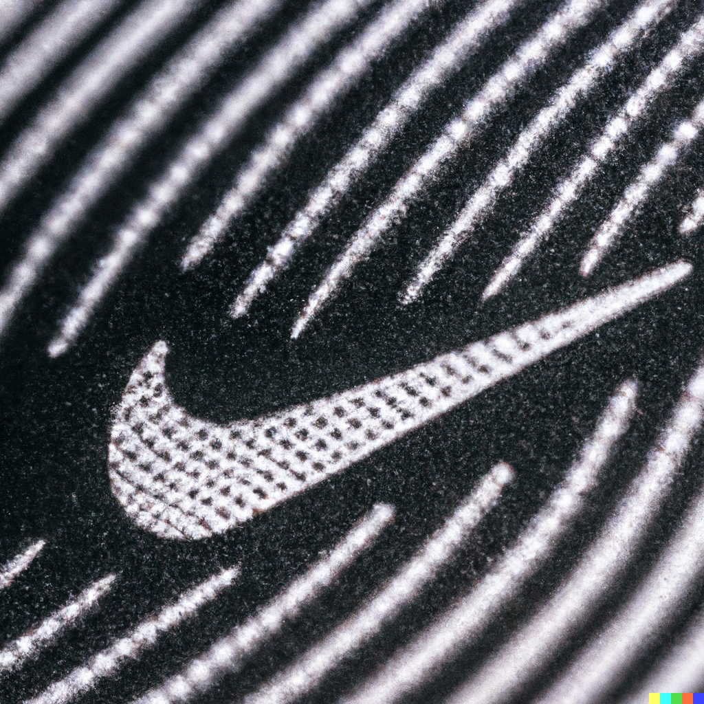
Close up macro photo of finger tip with nike logo in fingerprint
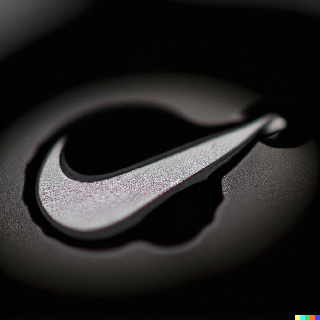
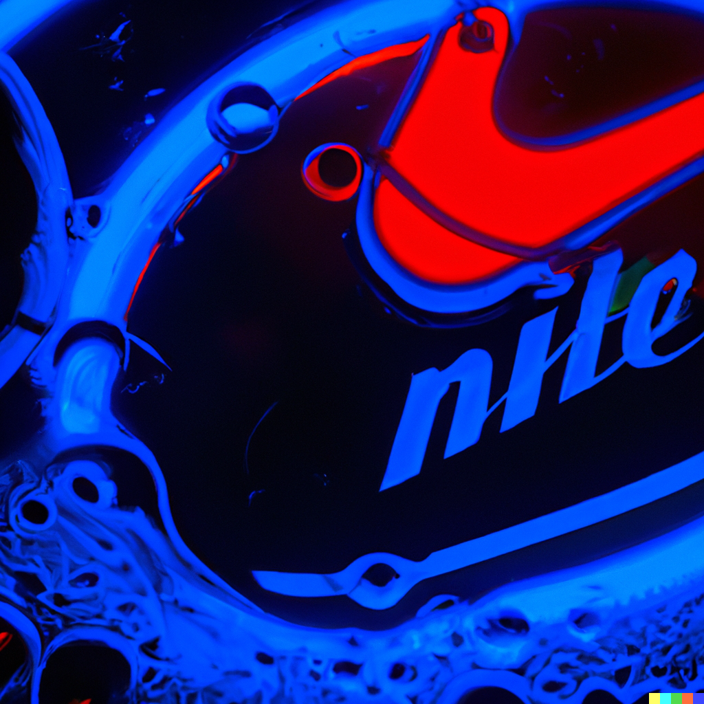
Close up photo of finger tip with nike logo in fingerprint
Close up photo of nike logo in fingerprint
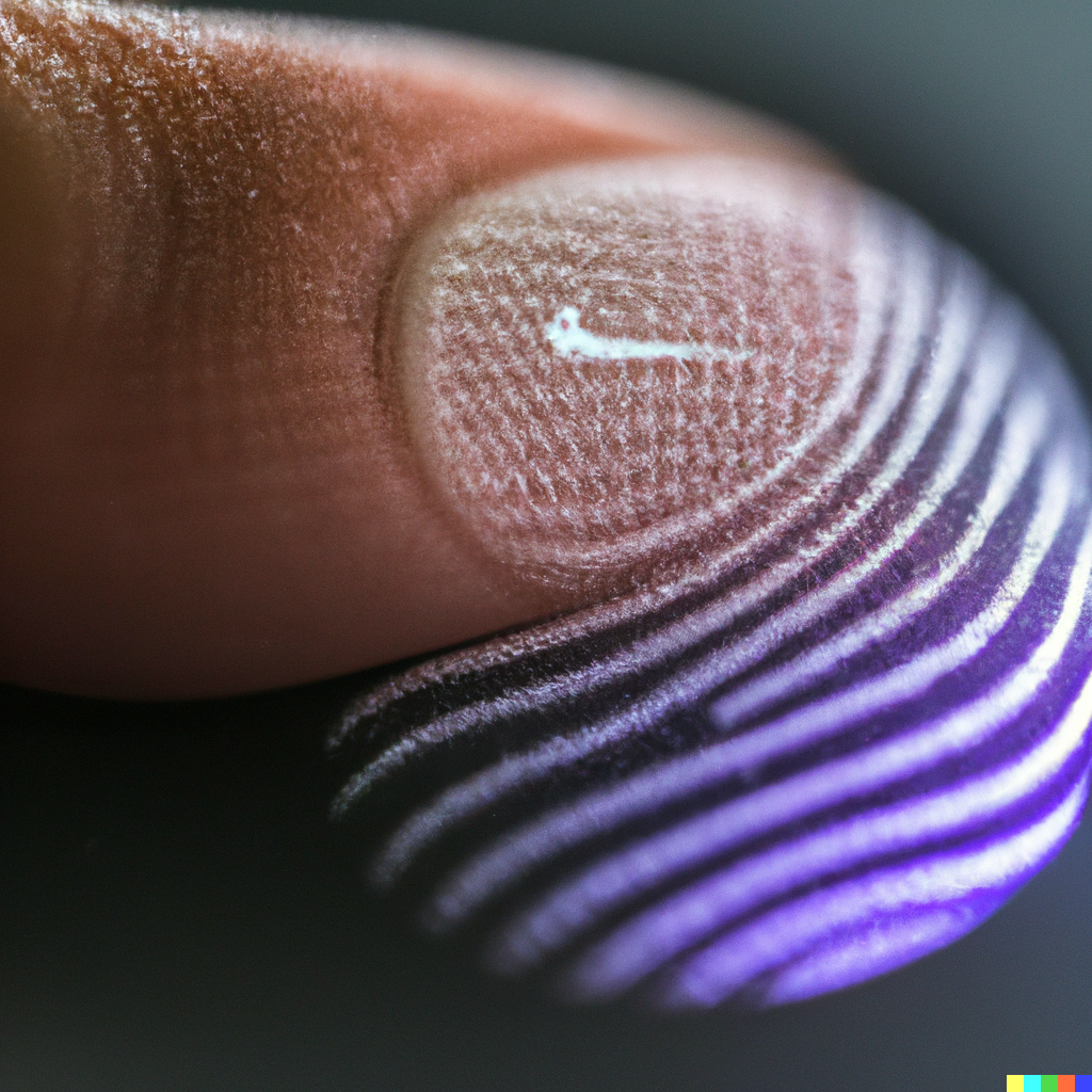
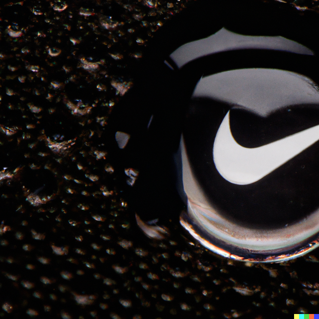
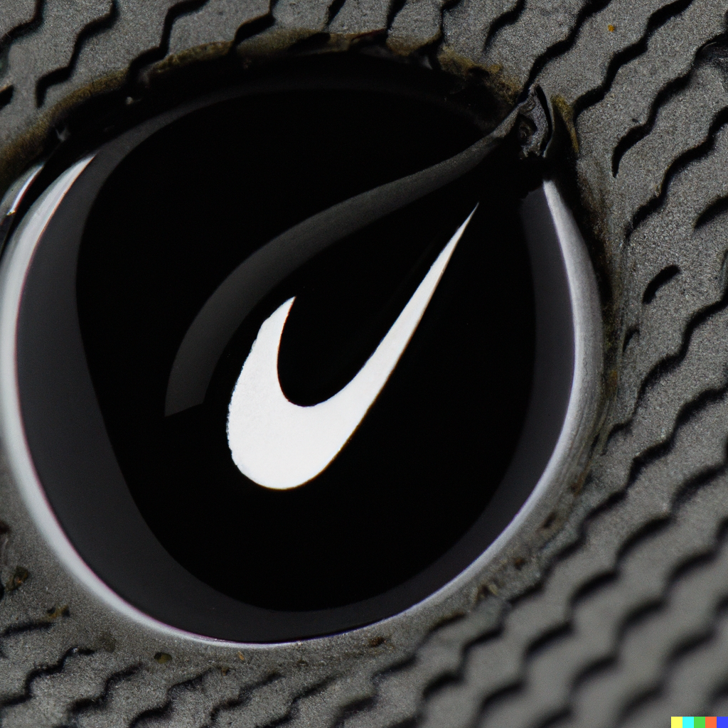
close up photo of finger tip with black drop liquid and inside is a nike logo reflection
Generated variations x2
photo of finger tip with black drop liquid and inside is a nike logo reflection
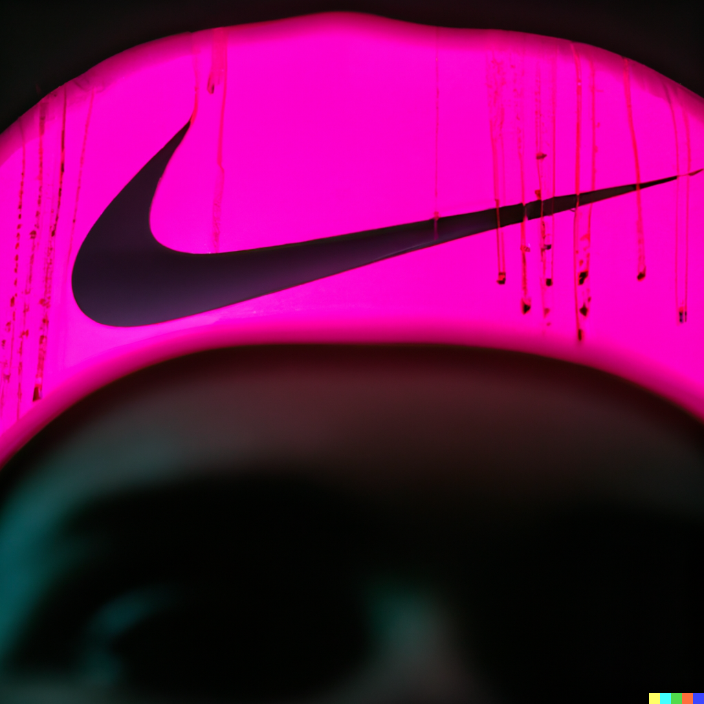
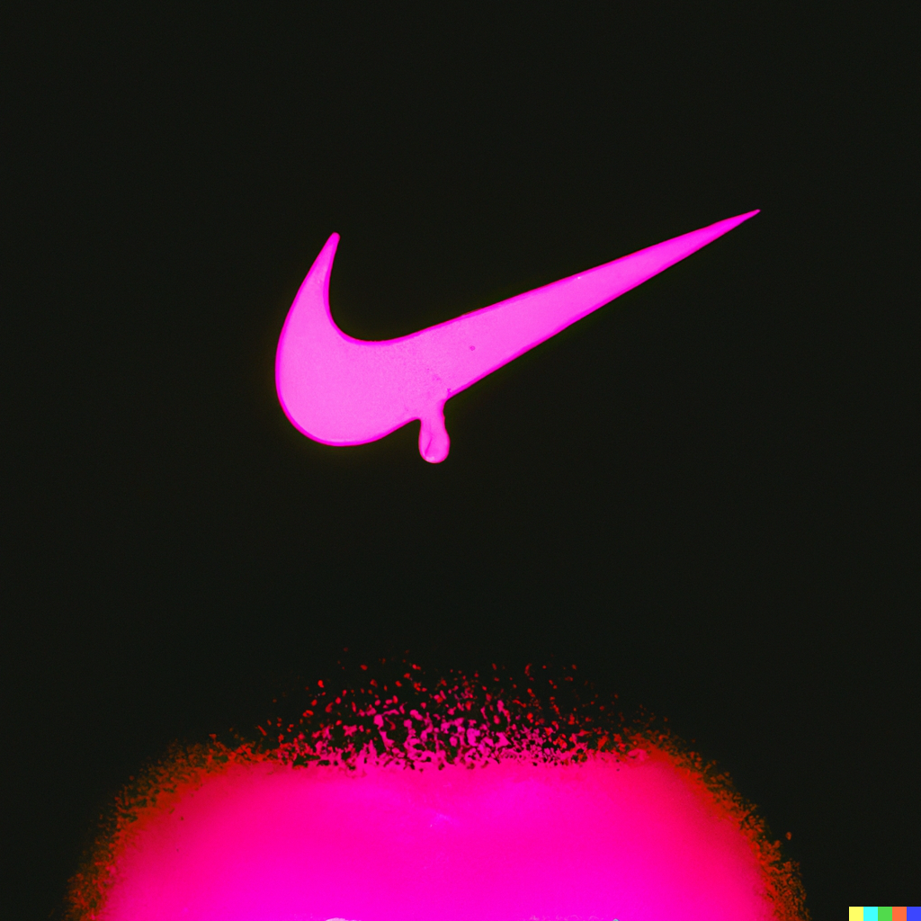
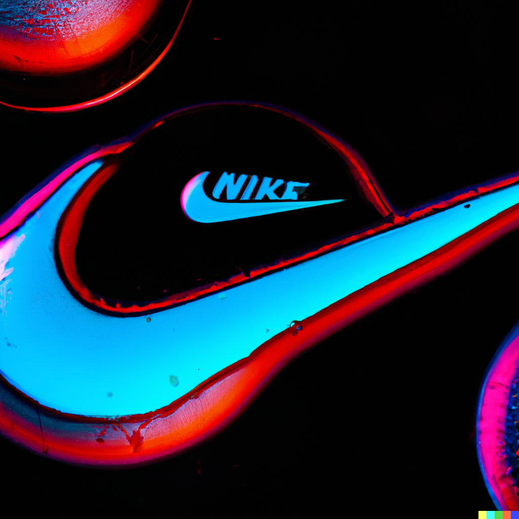
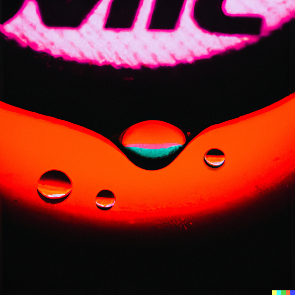
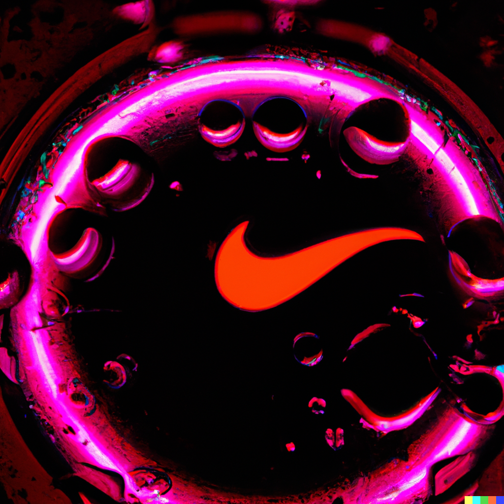
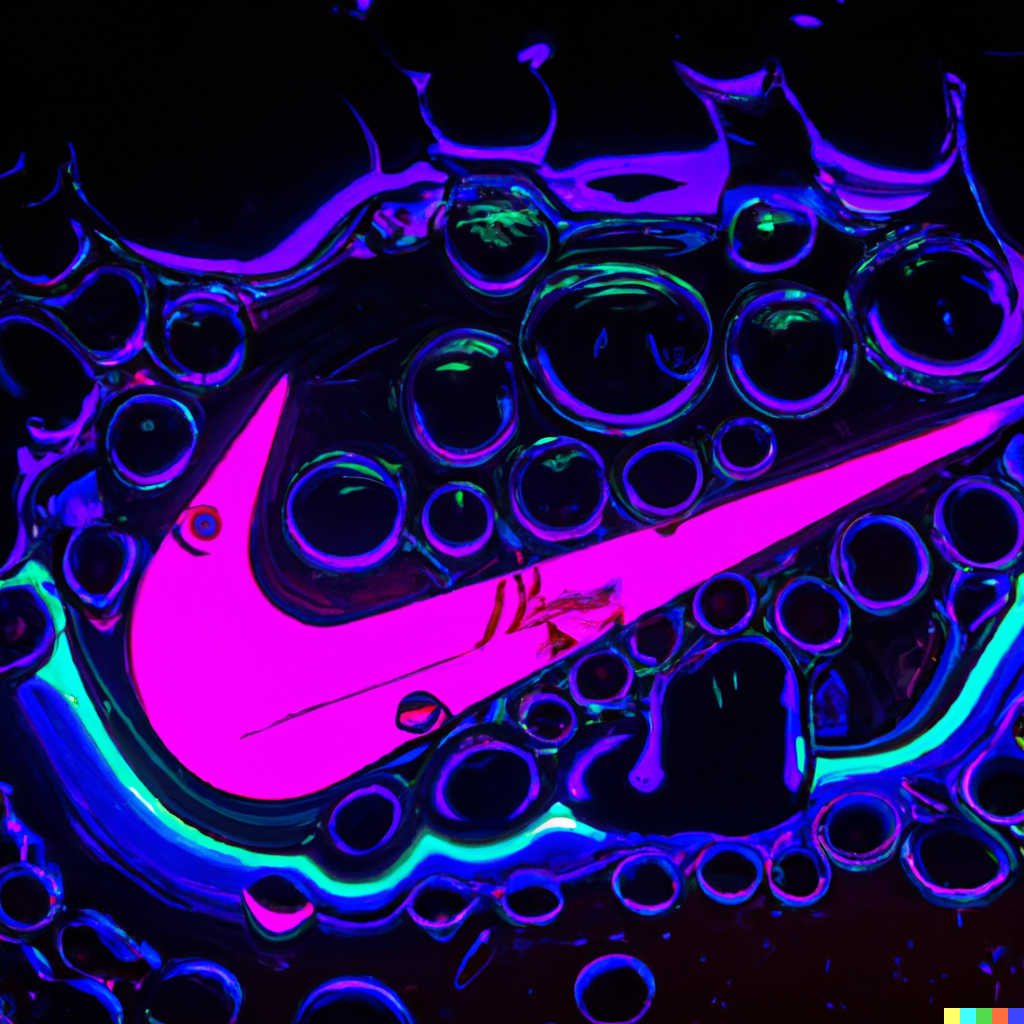
photo of finger tip with a small drop of neon pink liquid and inside the liquid is a nike logo reflection
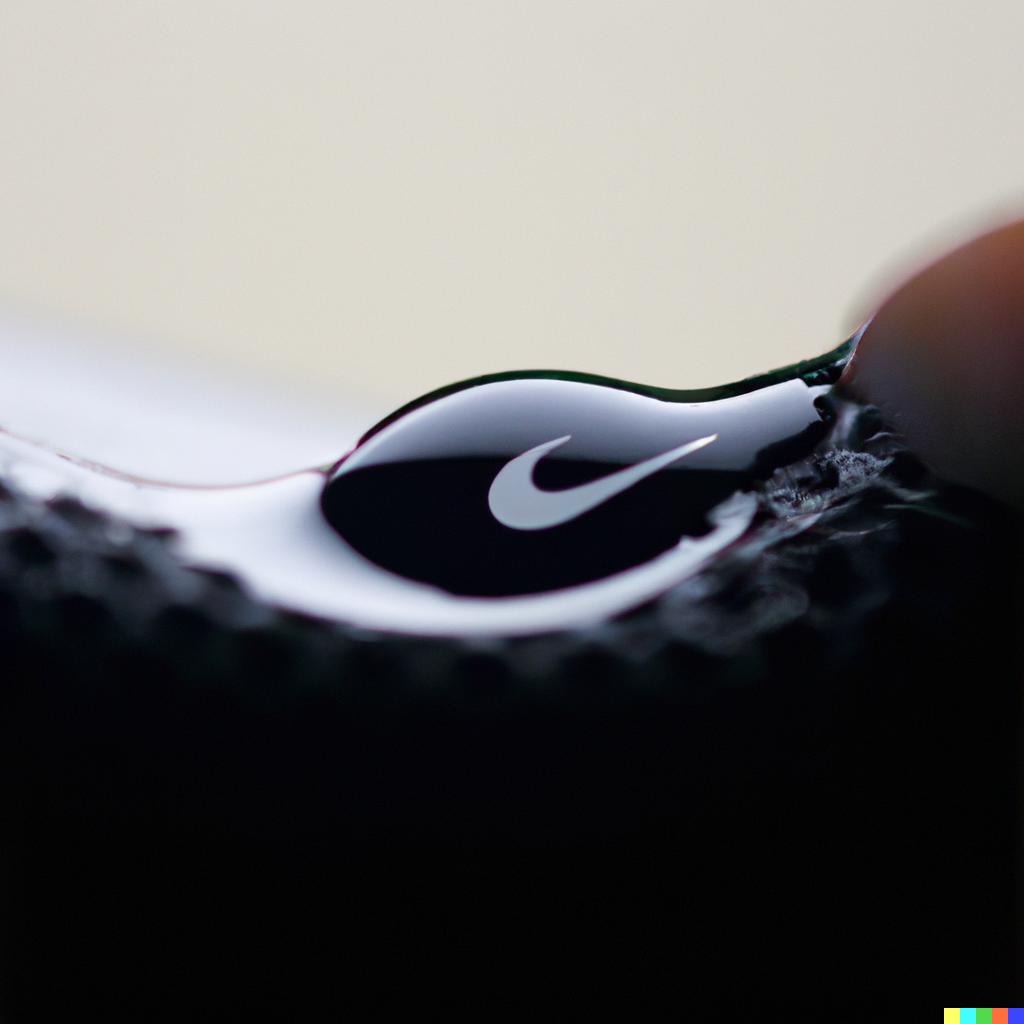
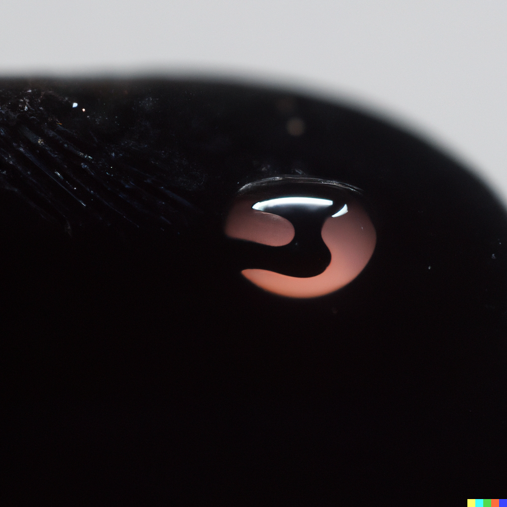
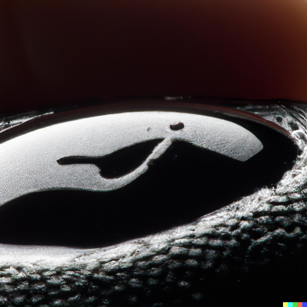
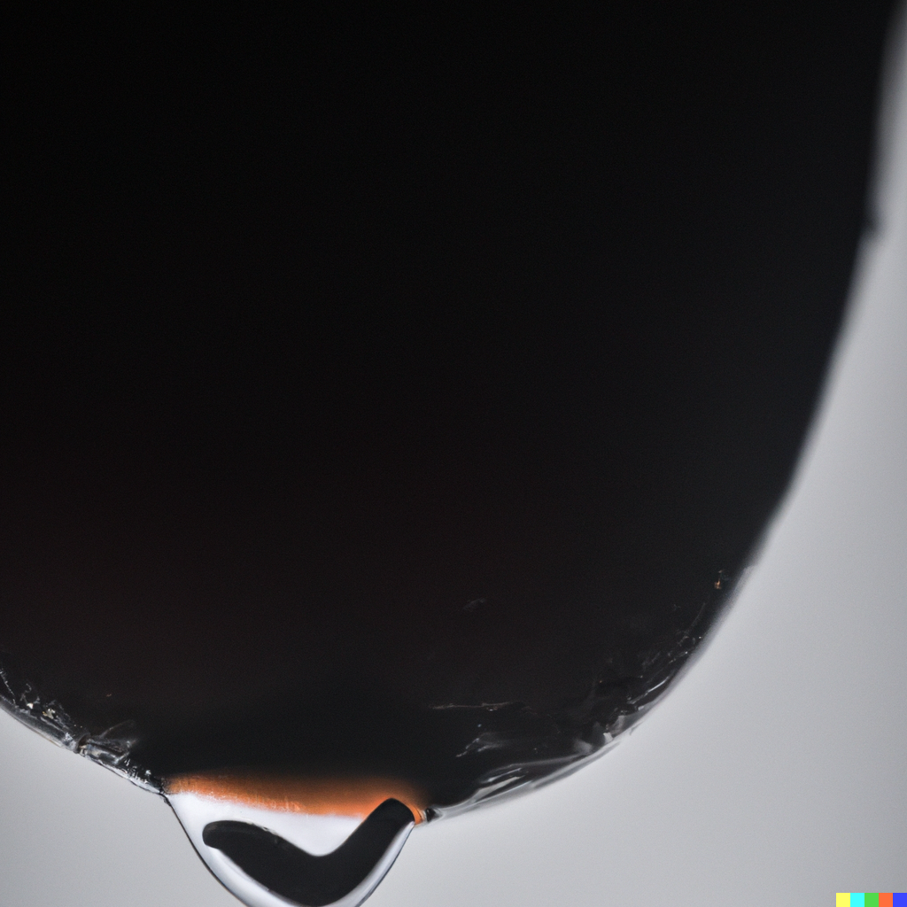
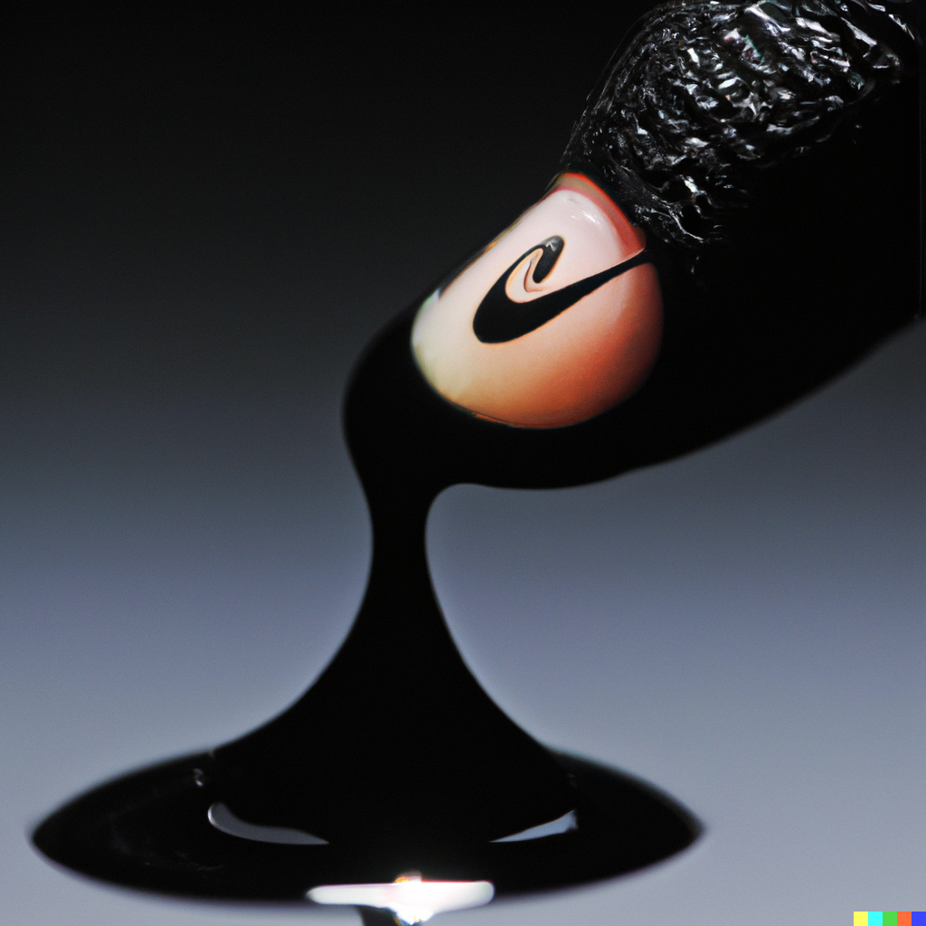
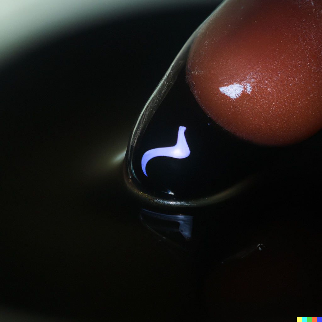
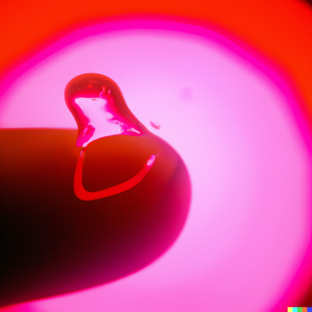
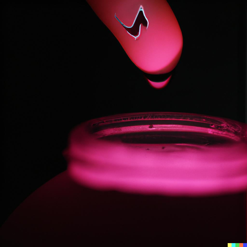
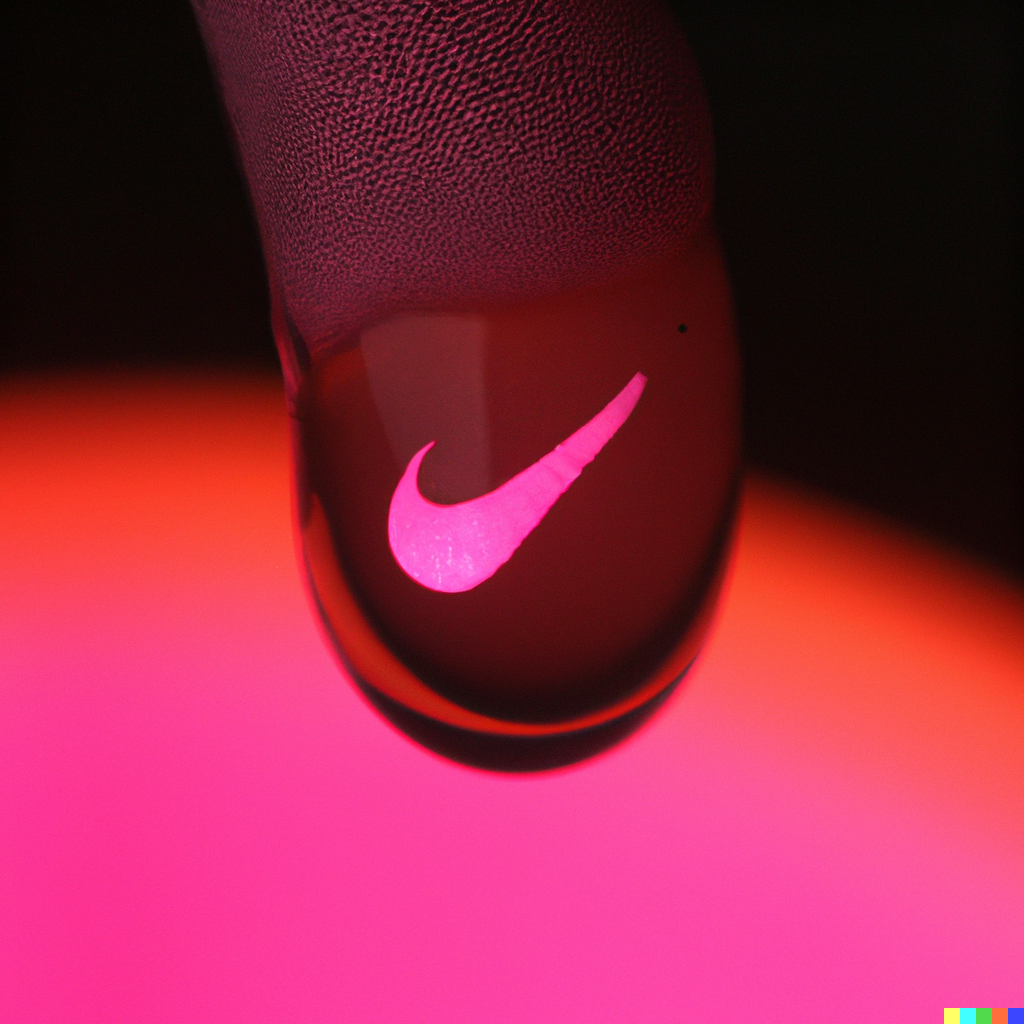
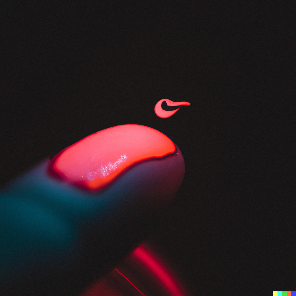
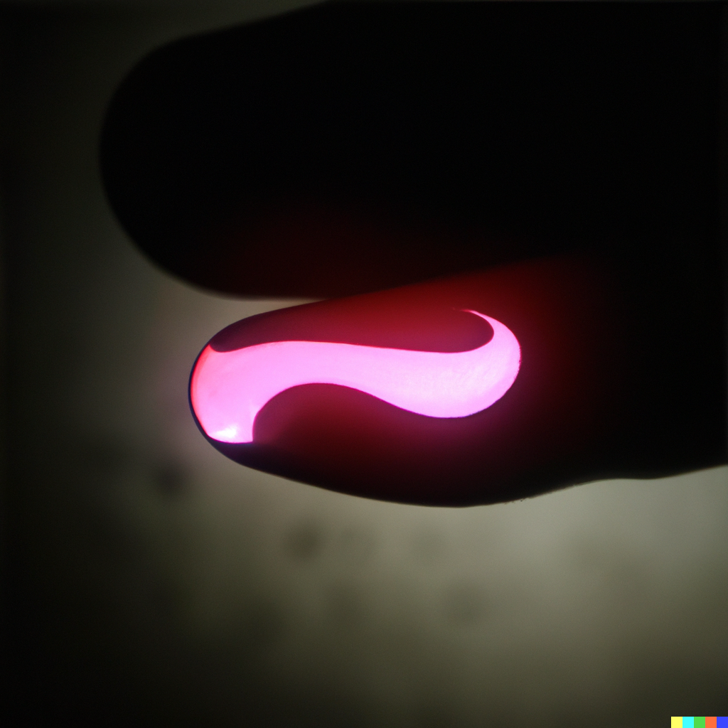
photo of a forehead with neon pink sweat on it, and in the sweat is a reflection of a nike logo
photo of a forehead with dripping neon pink sweat logo of nike
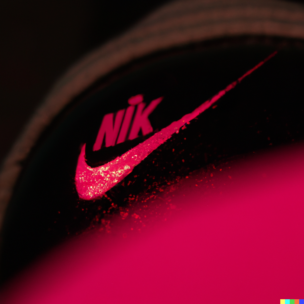
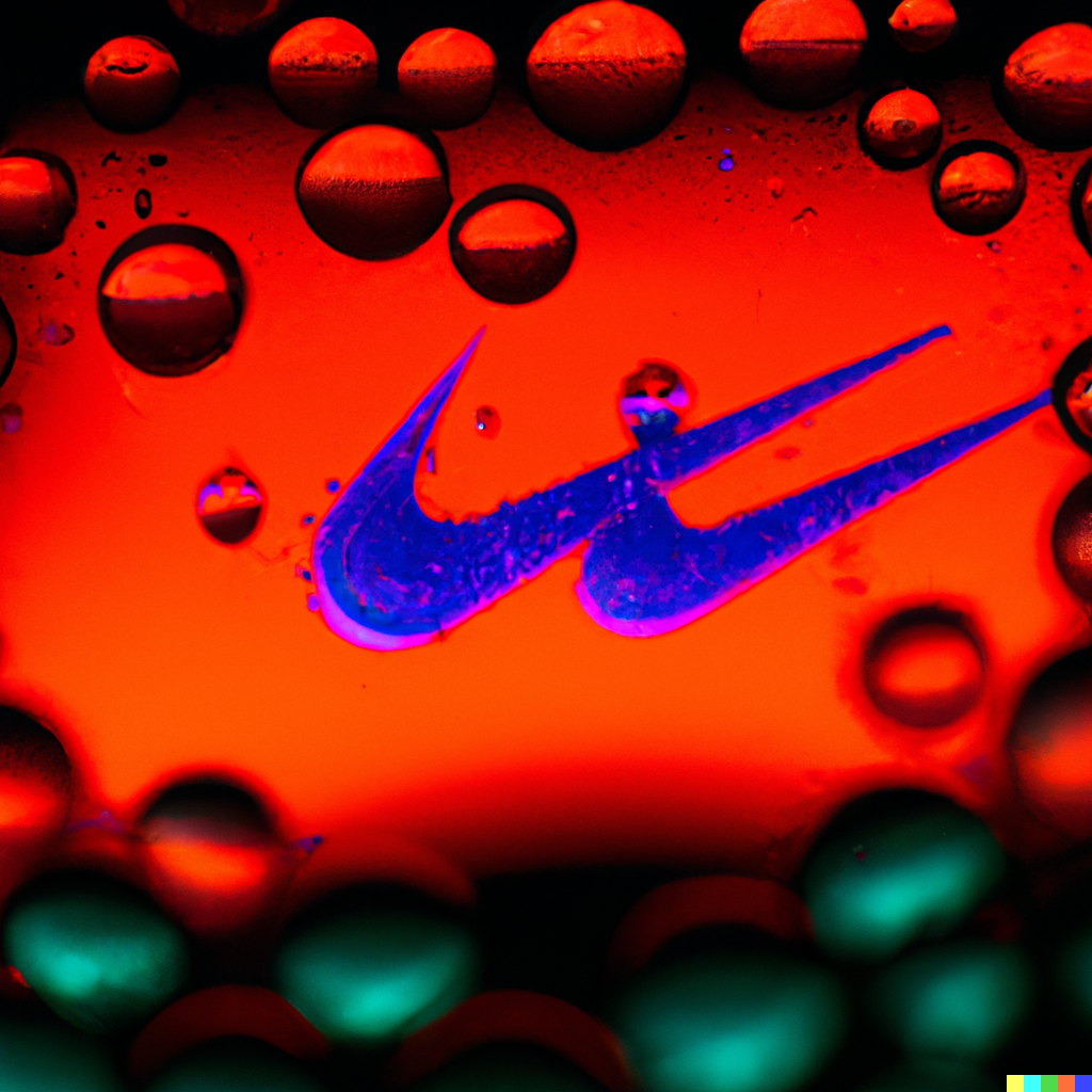
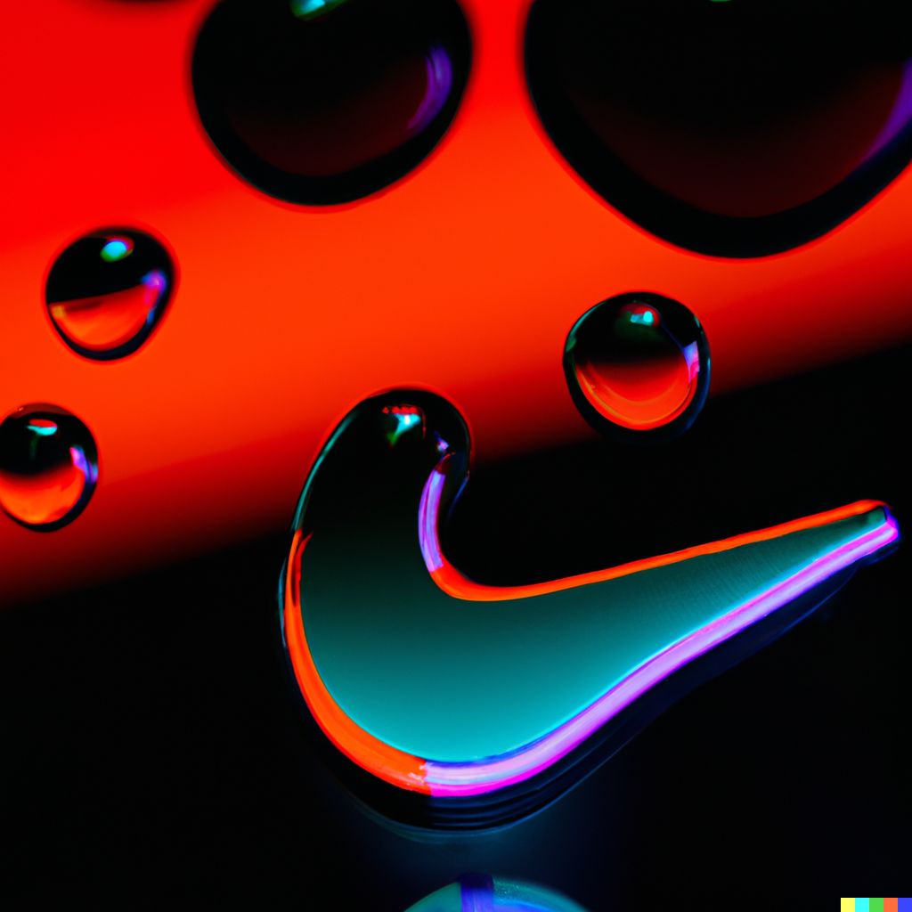
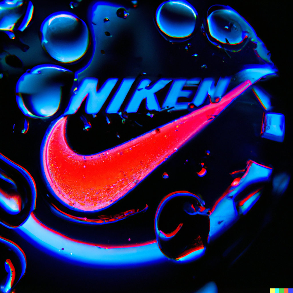
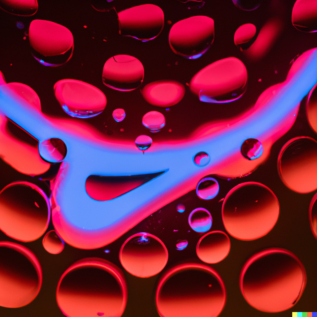
finger tip with black drop liquid and inside is a nike logo reflection
black drop liquid and inside is a nike logo reflection
Macro photo black drop liquid and inside is a nike logo reflection
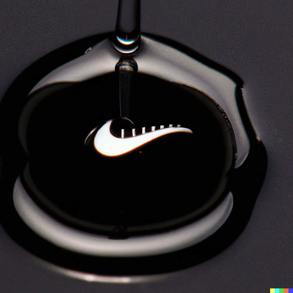
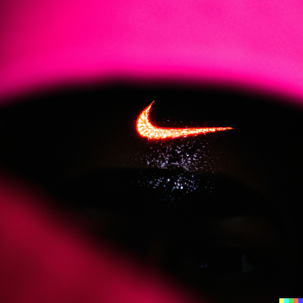
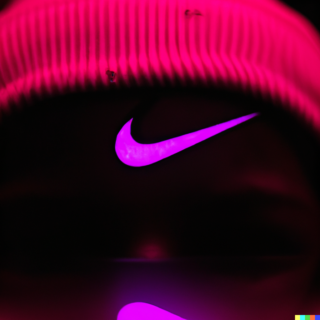
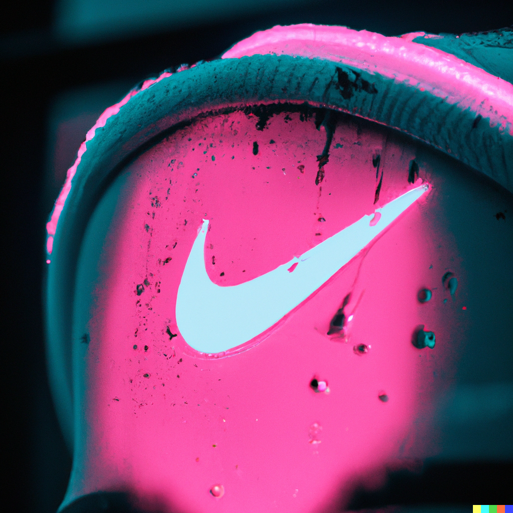
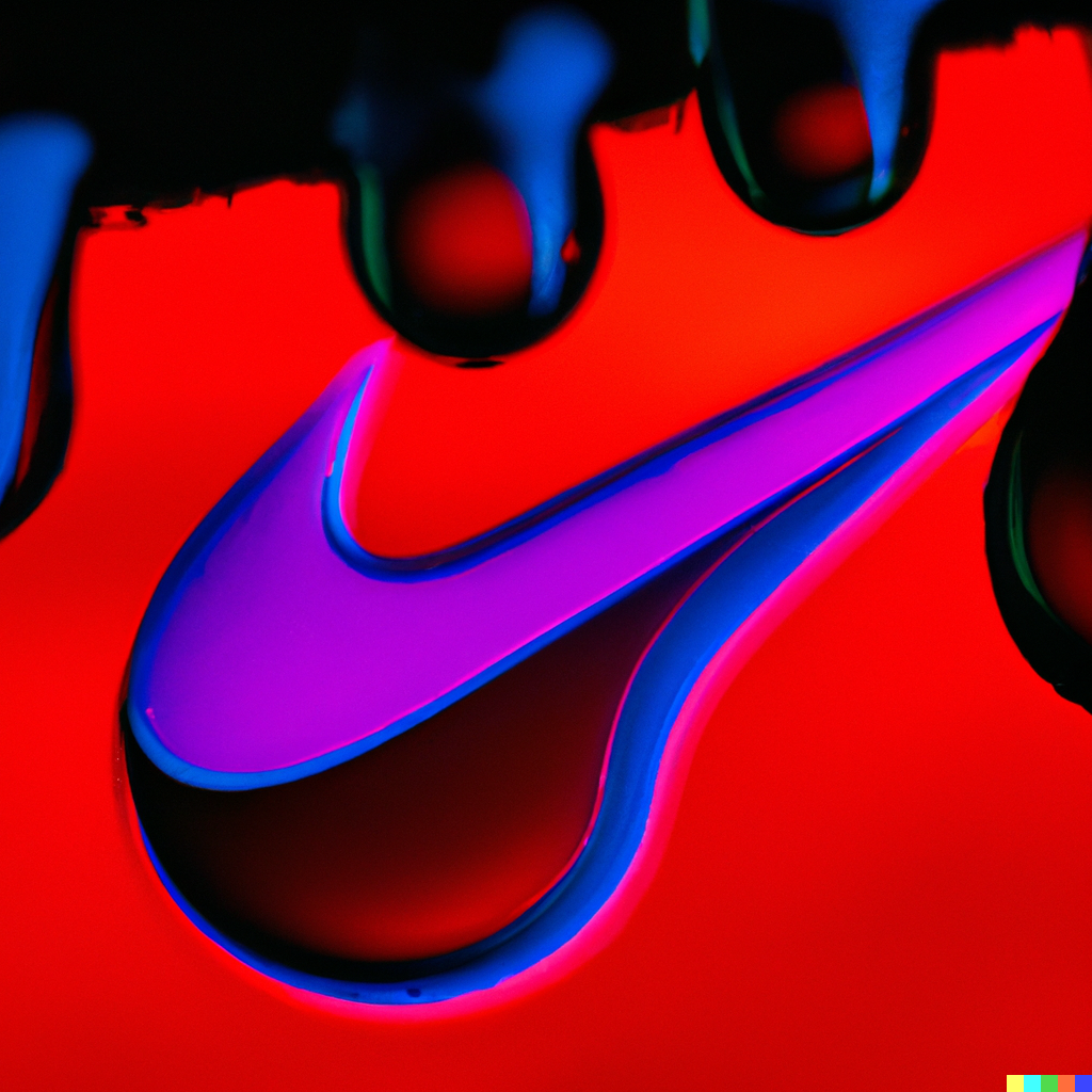
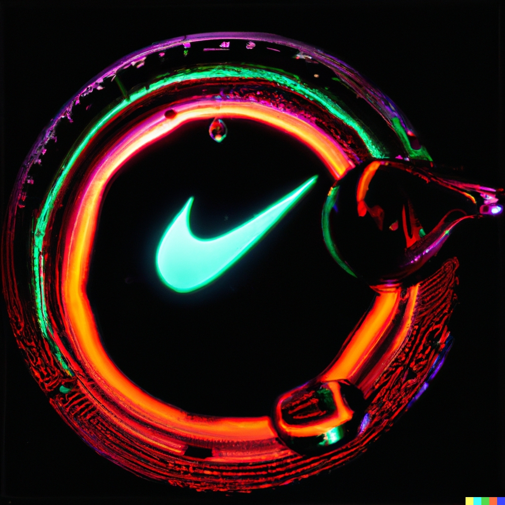
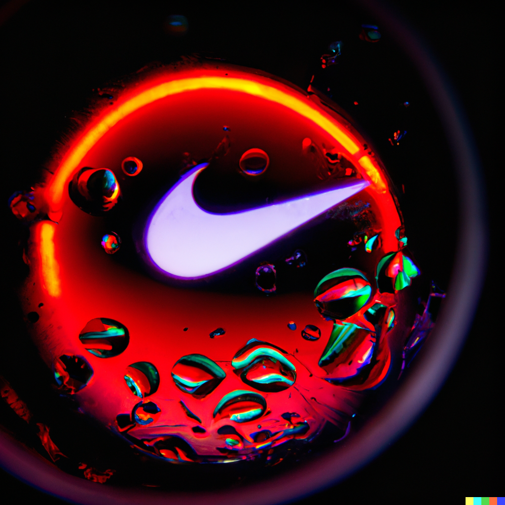
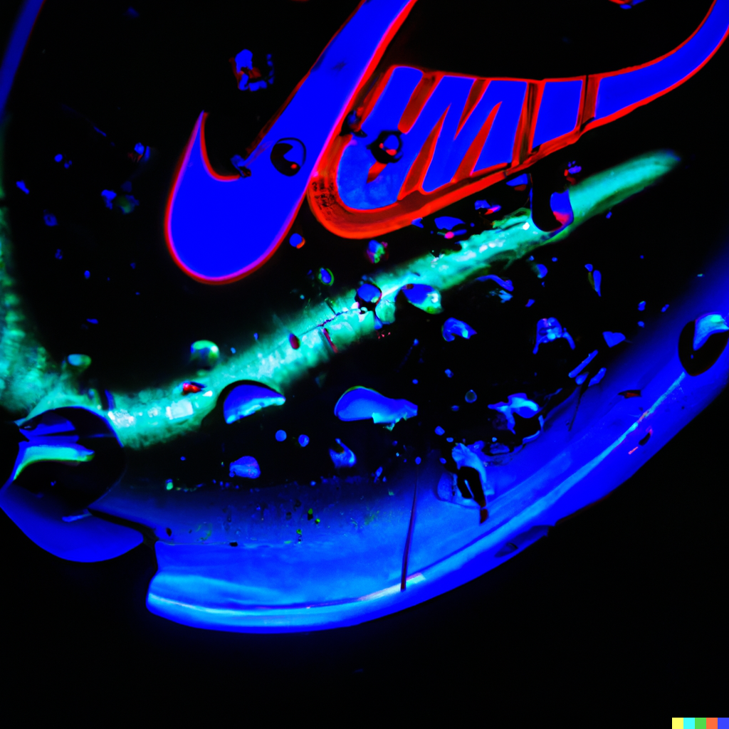
macro photo of neon drops of liquid and inside is a nike logo reflection
fisheye lens photo of neon drops of liquid and inside is a nike logo reflection
neon drops of liquid and inside is a nike logo reflection, wide angle
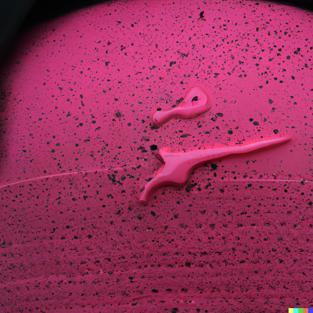
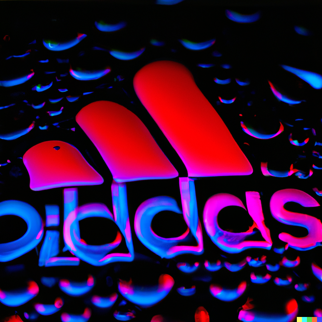
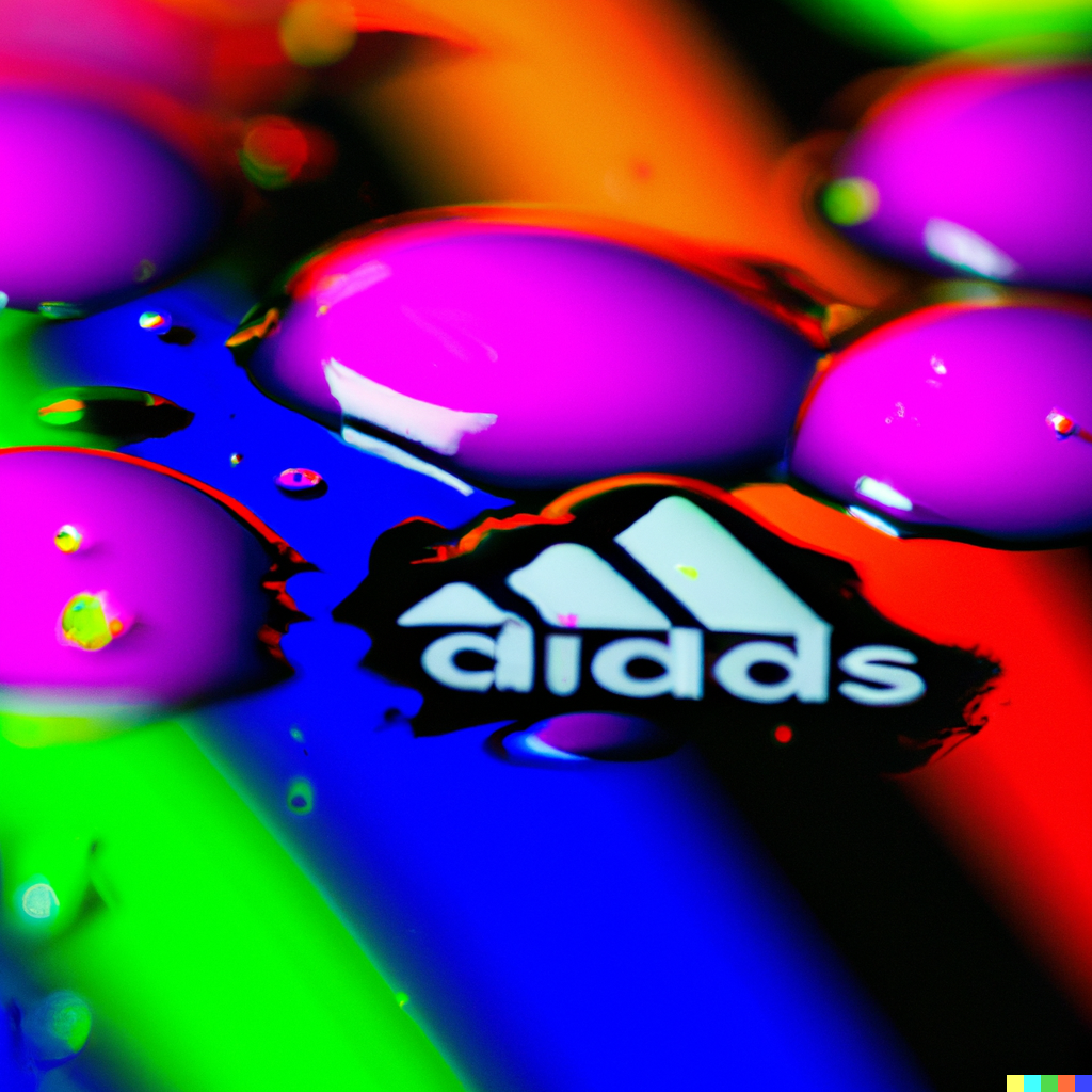
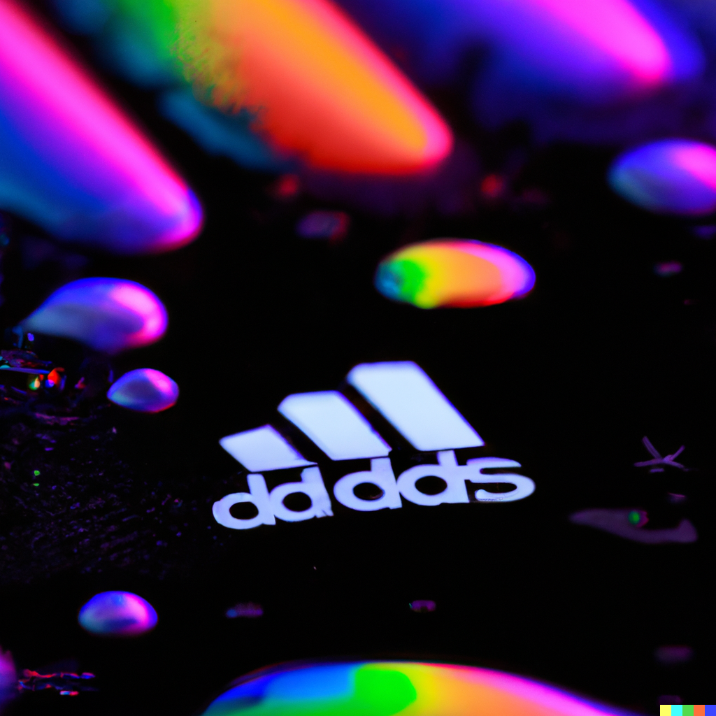
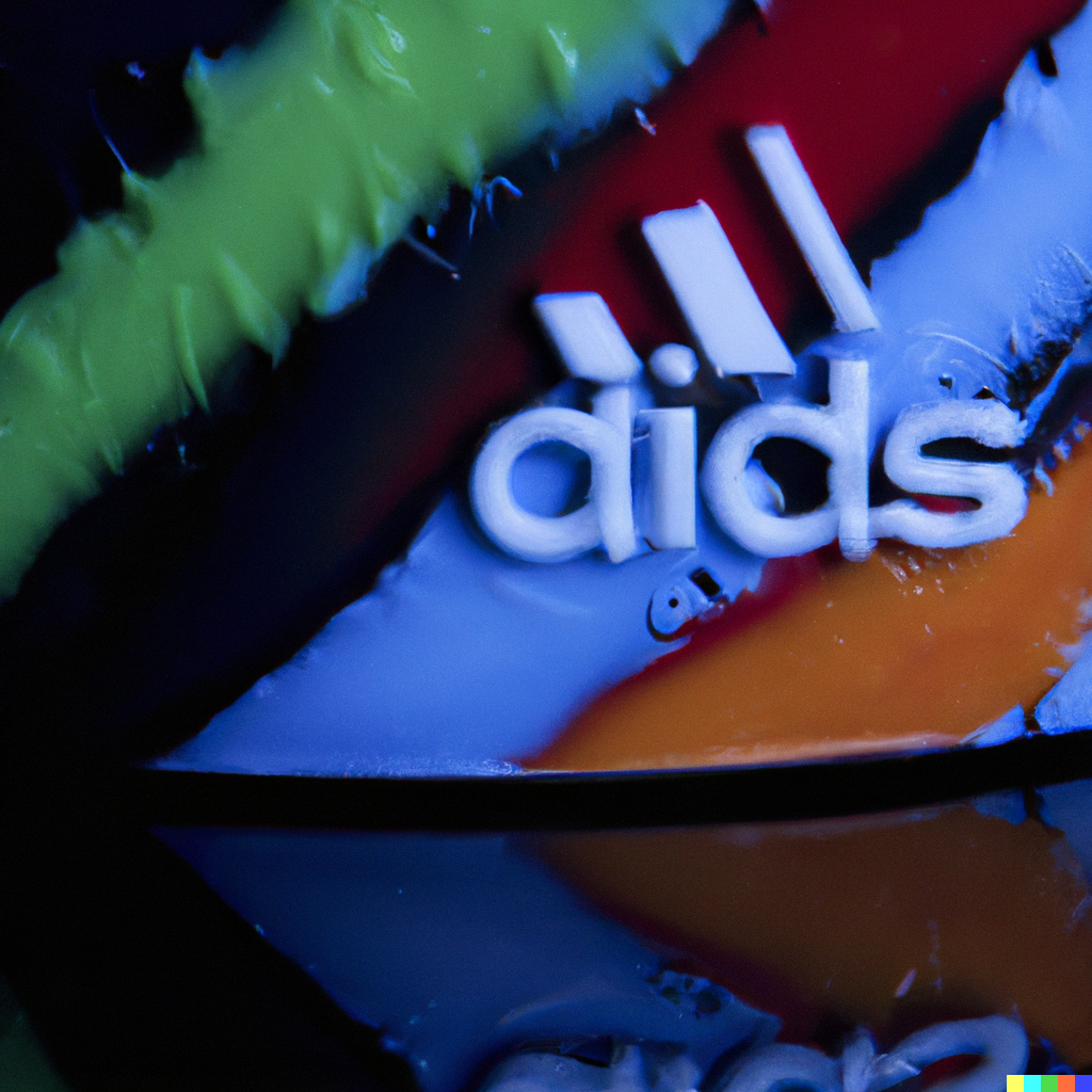
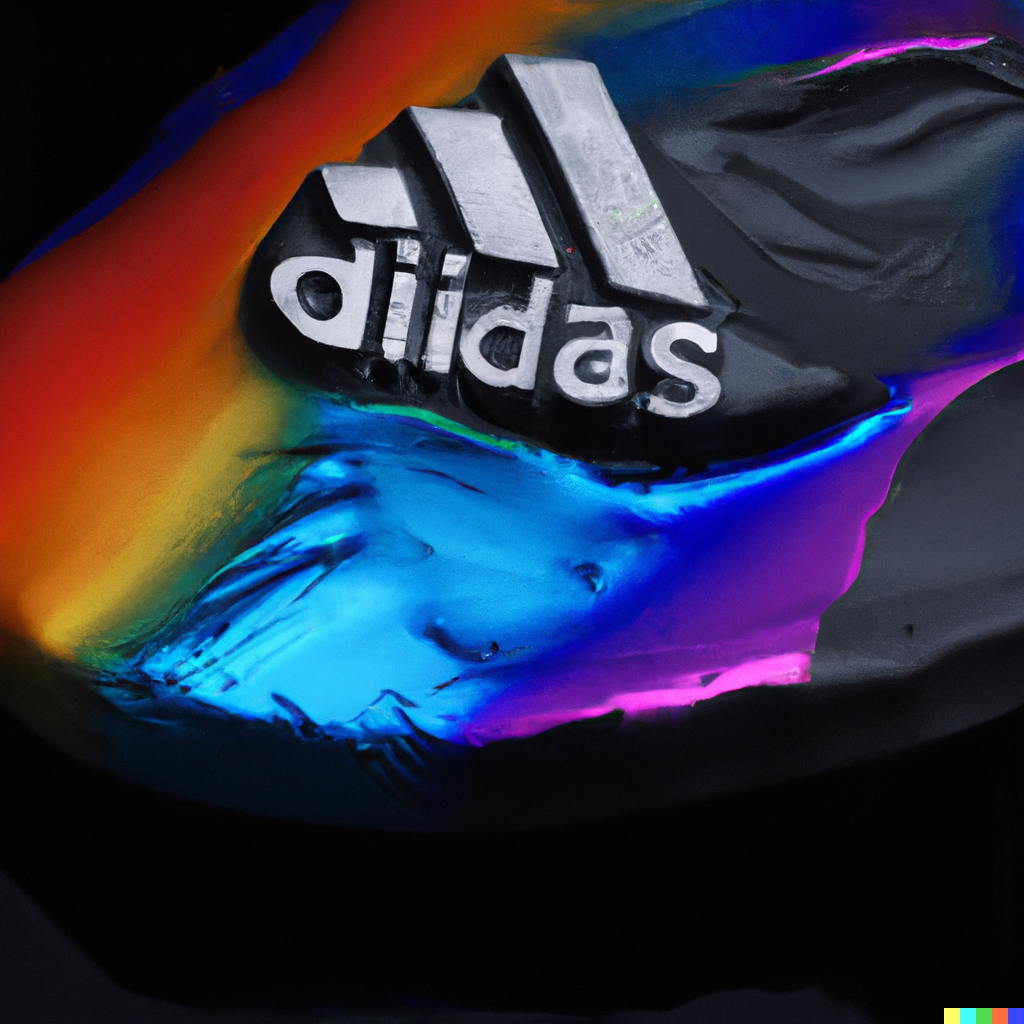
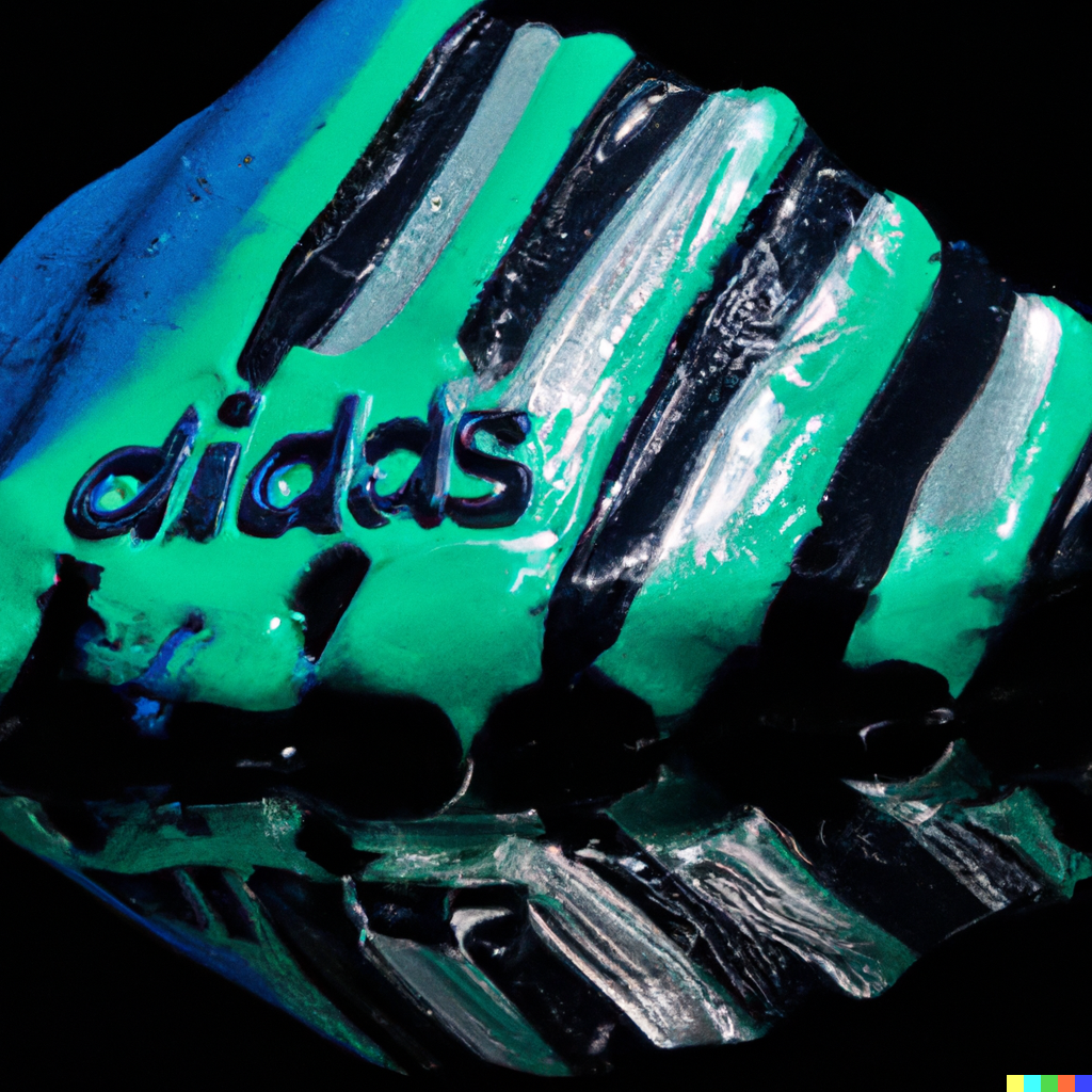
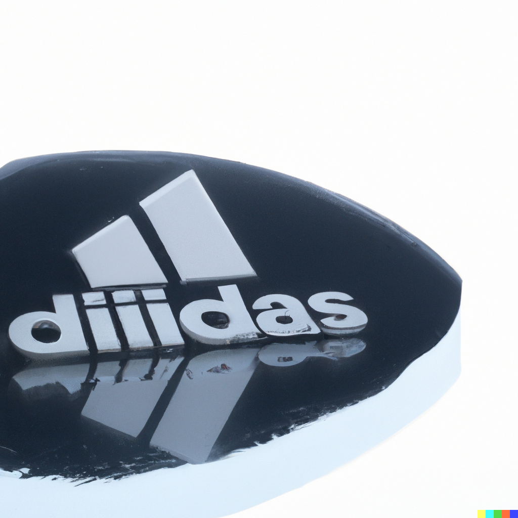
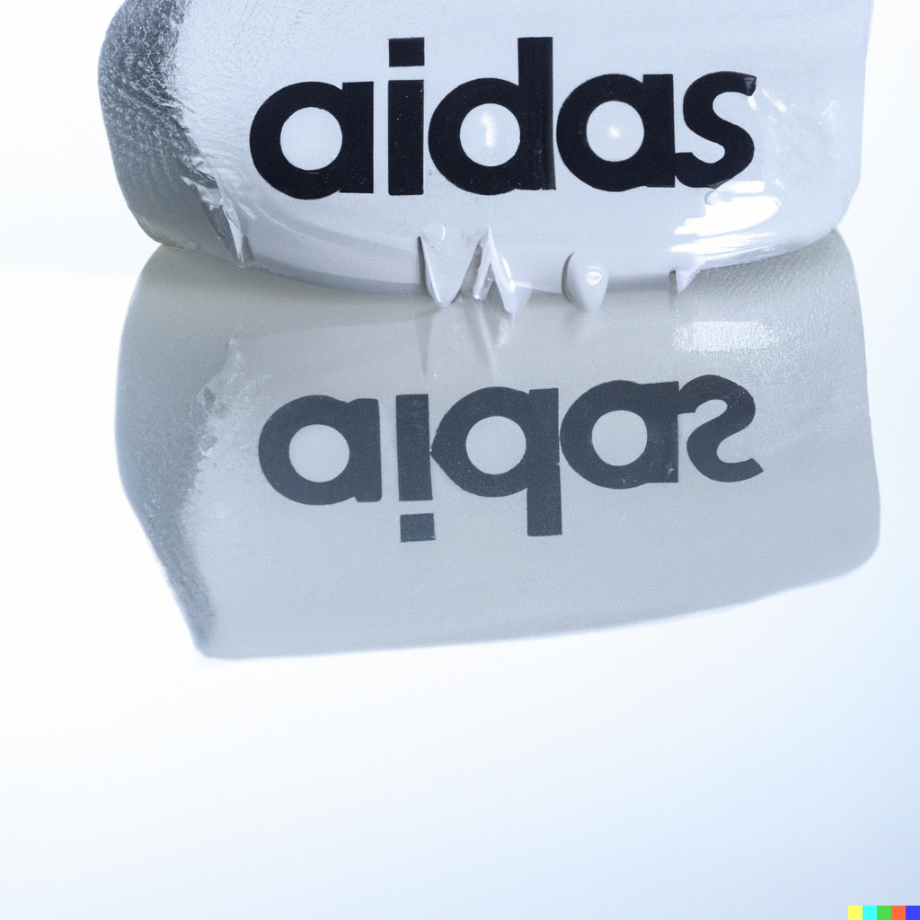
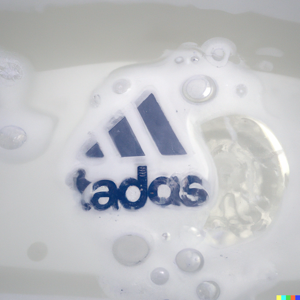
macro photo of neon drops of liquid and inside is an adidas logo reflection
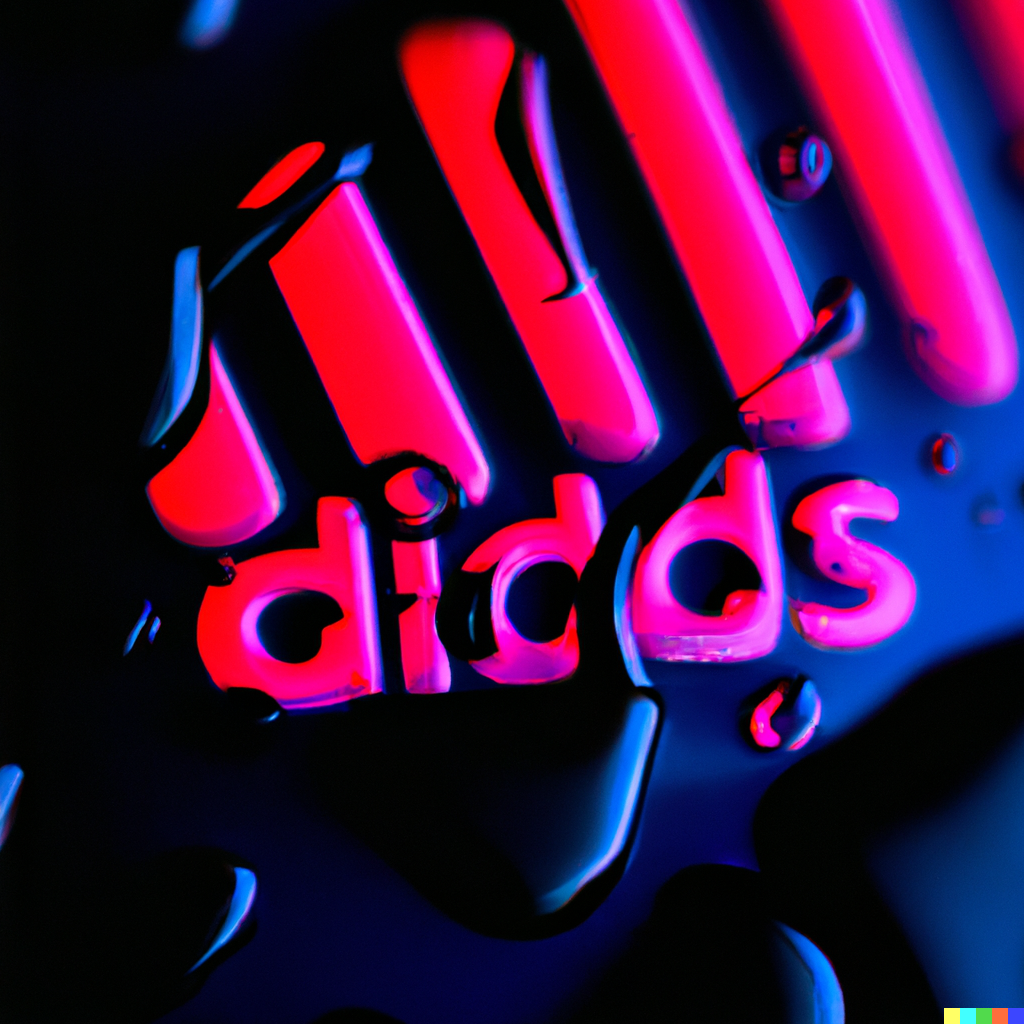
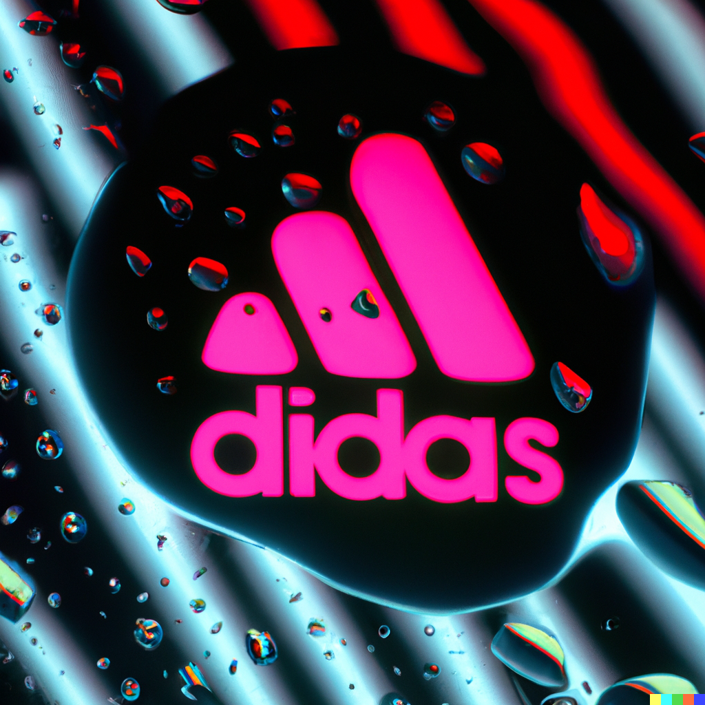
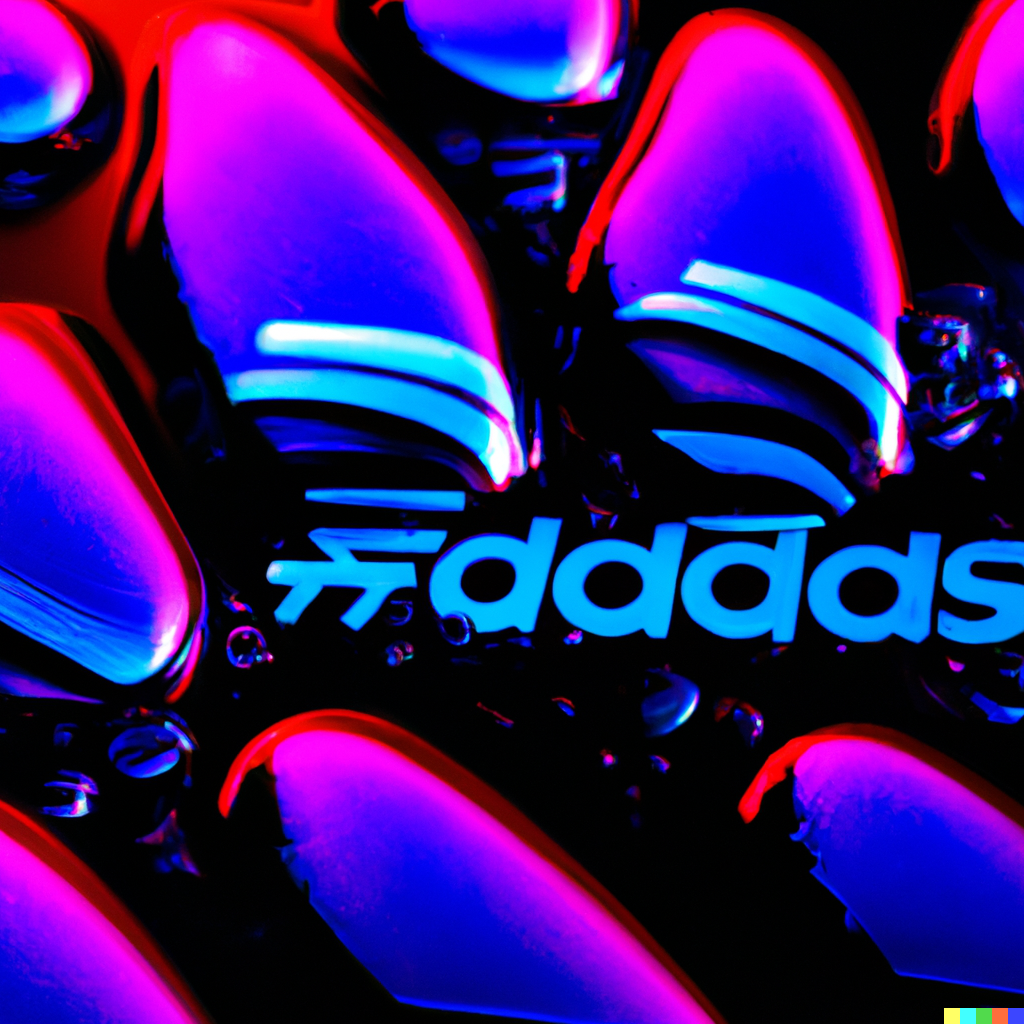
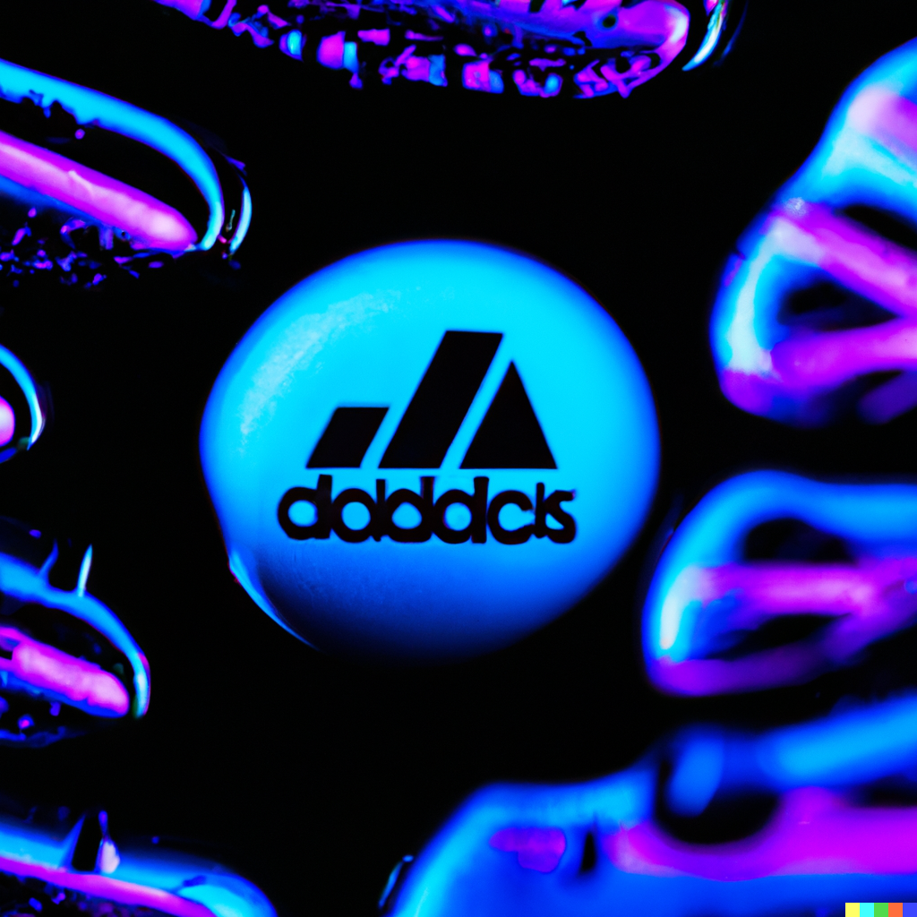
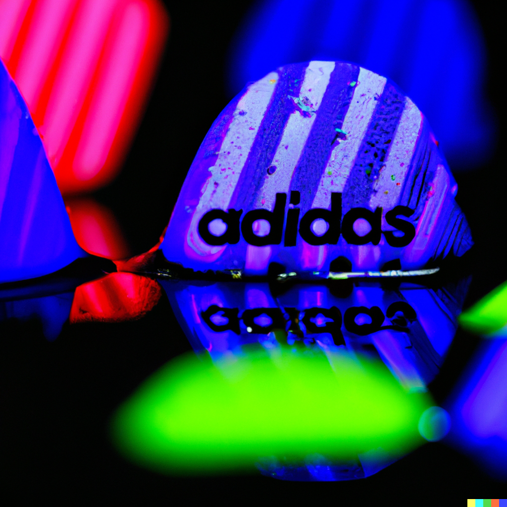
thick colored resin and inside is an adidas logo reflection
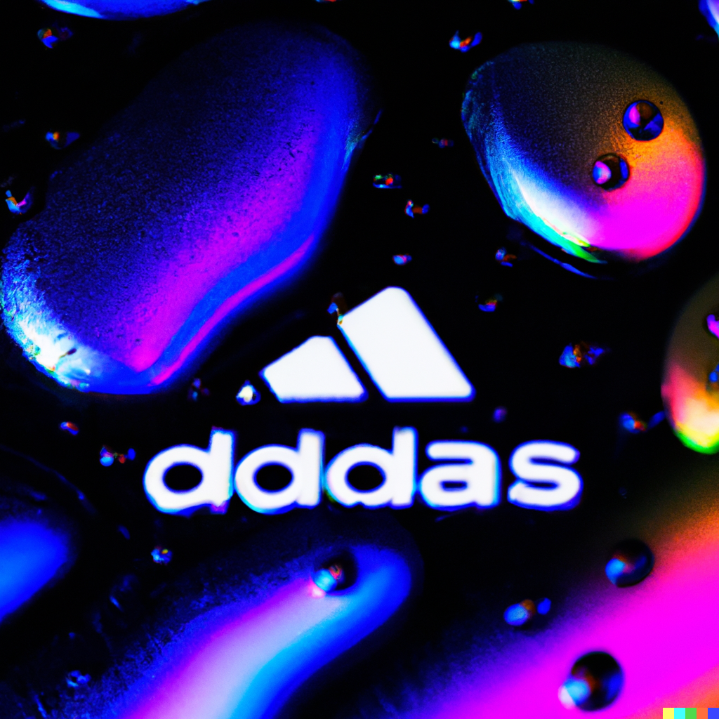
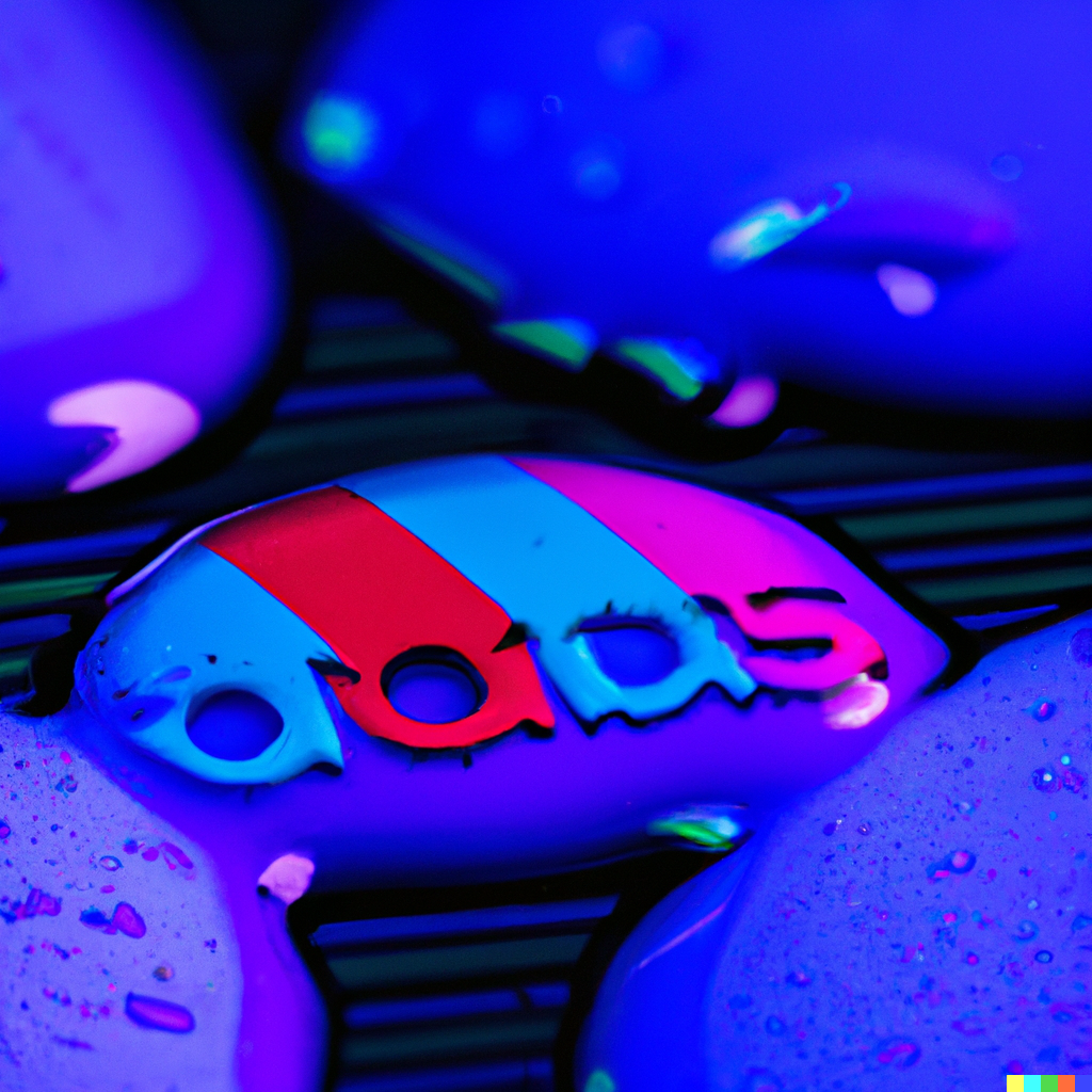
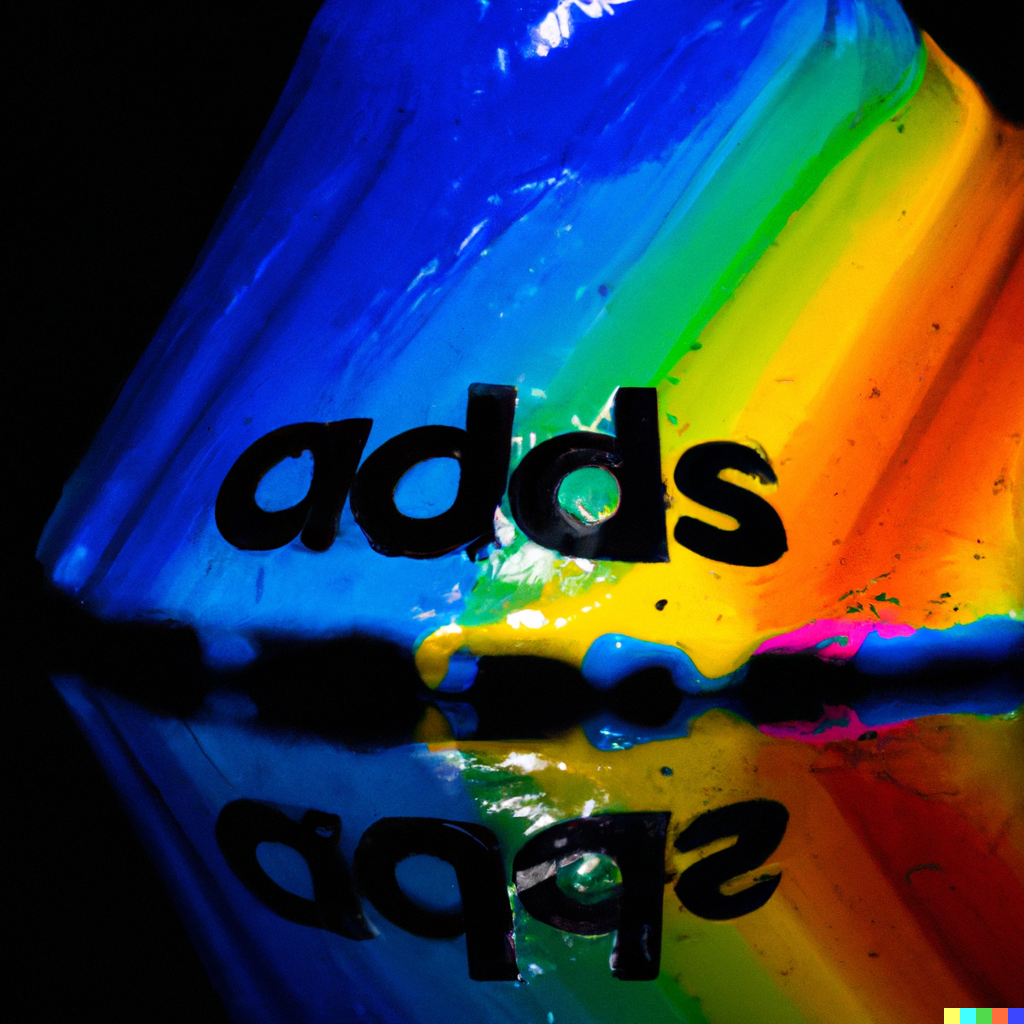
thick, soft, opaque resin and inside is an adidas logo reflection, on white space background
thick, soft, opaque resin and inside is an adidas logo, on white space background

fried egg with yolk shaped like nike logo
Photo of fried egg with yolk shaped like nike logo
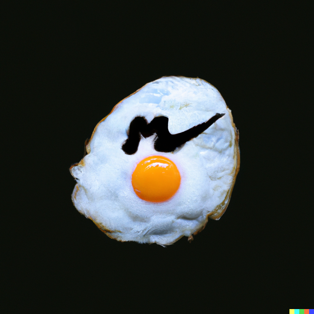
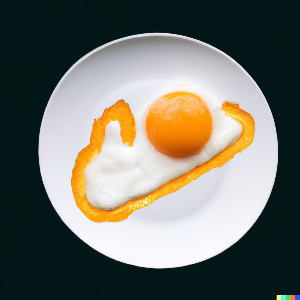
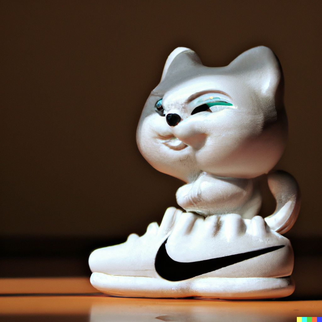
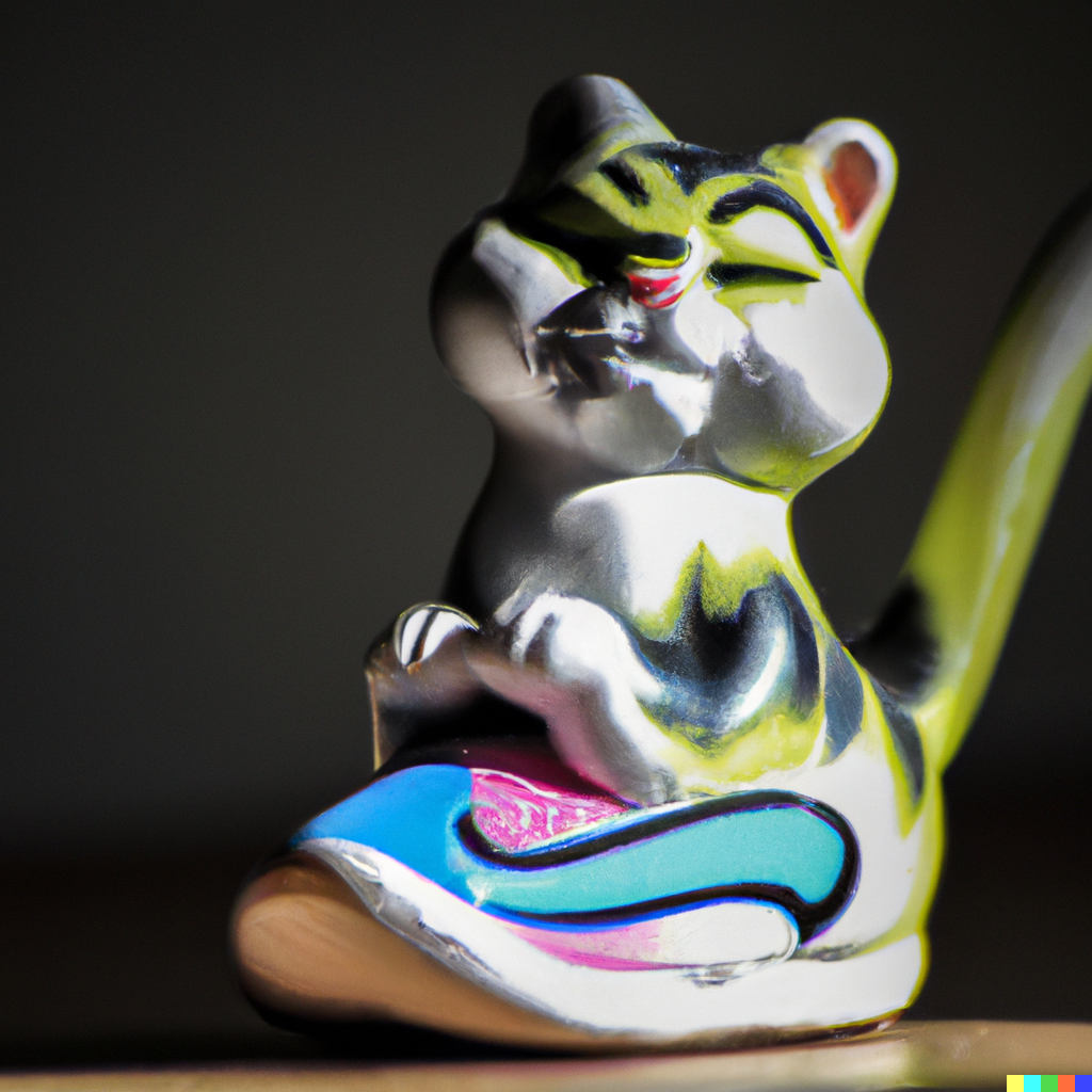
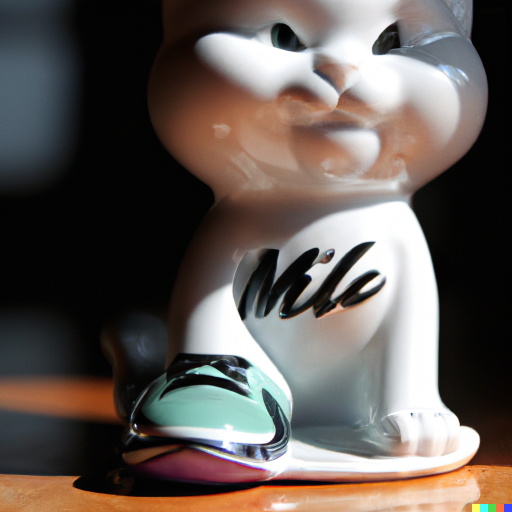
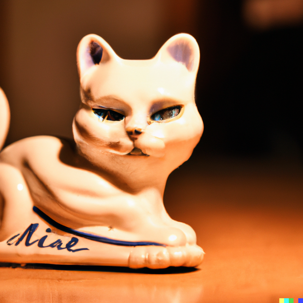
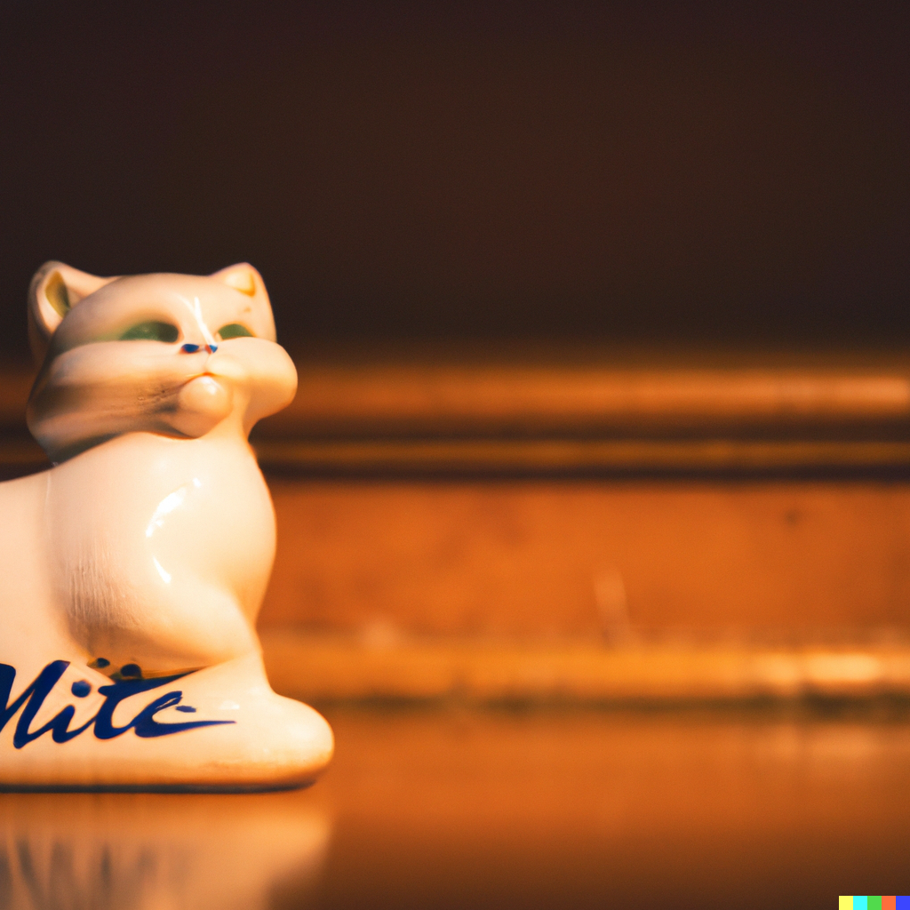
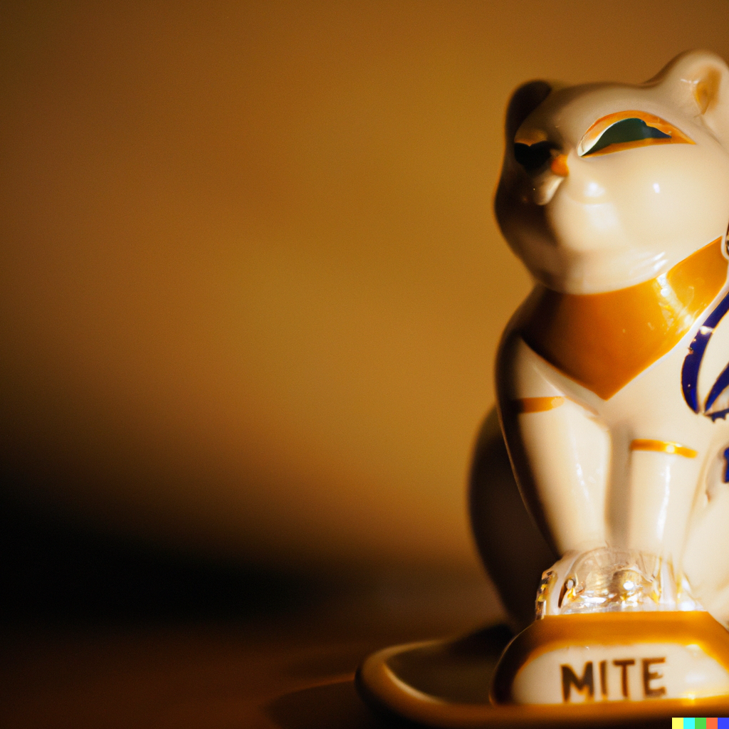
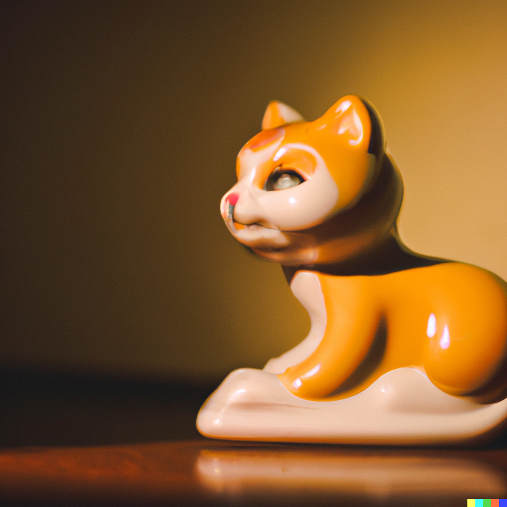
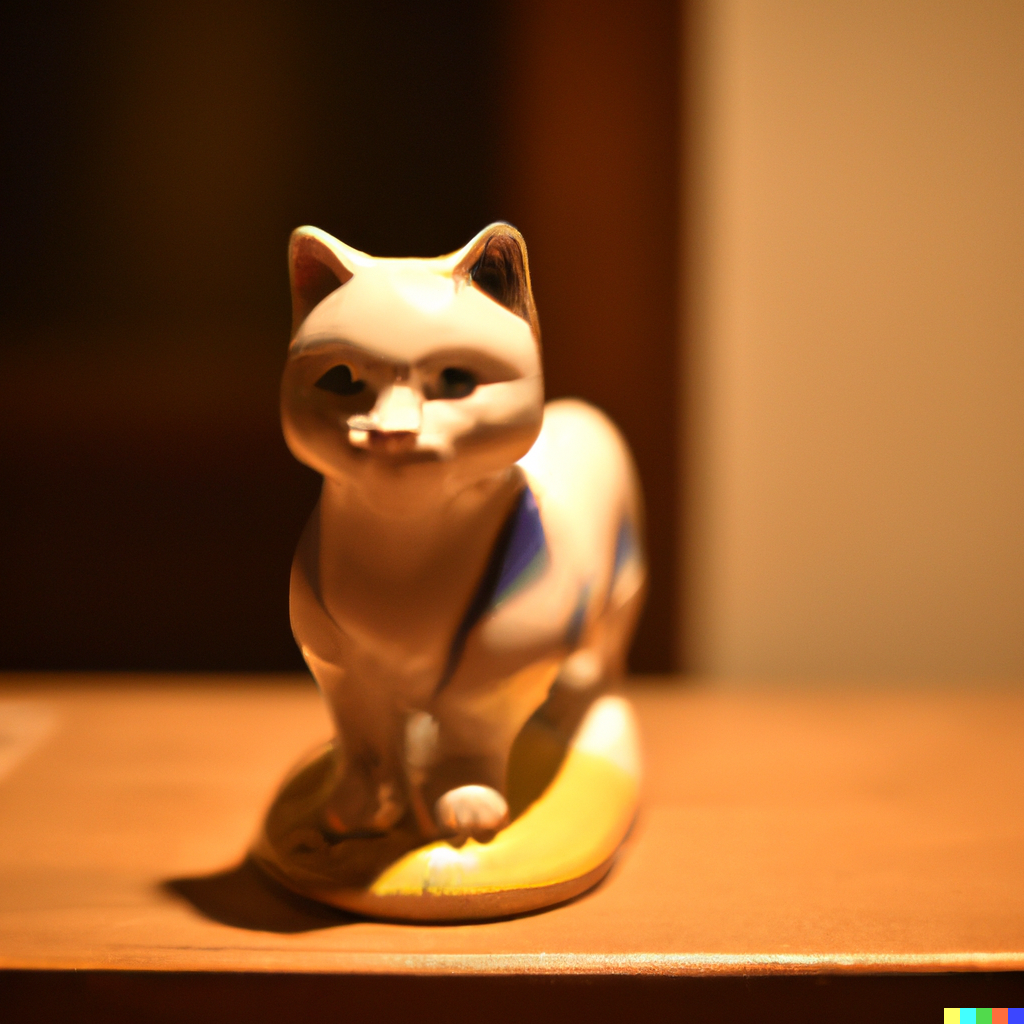
photo of cute porcelain cat with nike logo, natural lighting
photo of cute antique porcelain cat with nike logo, warm lighting
cute antique porcelain cat with nike logo, warm lighting
I just received access to Dall-E 2 by OpenAI. I’ll keep some documentation here about my process of figuring out how to best approach this tool.
Initially, my excitement over this came a lot from the images I’d seen around the internet, more recently those by @nandocosta using MidJourney AI. So, I started trying to make images similar to what I’d seen. I quickly realized on this first round just how hard it is to get what you’re looking for. Precision is important but also the Dall-E 2 software can only mimic so many styles. For example a “Takashim Murakami” style image wouldn’t generate nearly as close to the artist’s style(silly me), and would more turn out to be like a cartoon repeated image. I only tried that reference a few times and found it not usable.
I think if you are looking to make beautiful style frames, it’s a balance of knowing what you’re looking for and then doing some photoshop editing? Instead of referencing a style, you might try to describe the style. Not a “Caravaggio painting”, but “a realistic shadowed oil painting” maybe lol. I dunno. Then take that image and begin to play with it in another software. Right now, Dall-E 2 is not the end of the iteration process but just you putting your hand in a bowl of suggestions.
Anyways, here are some images:
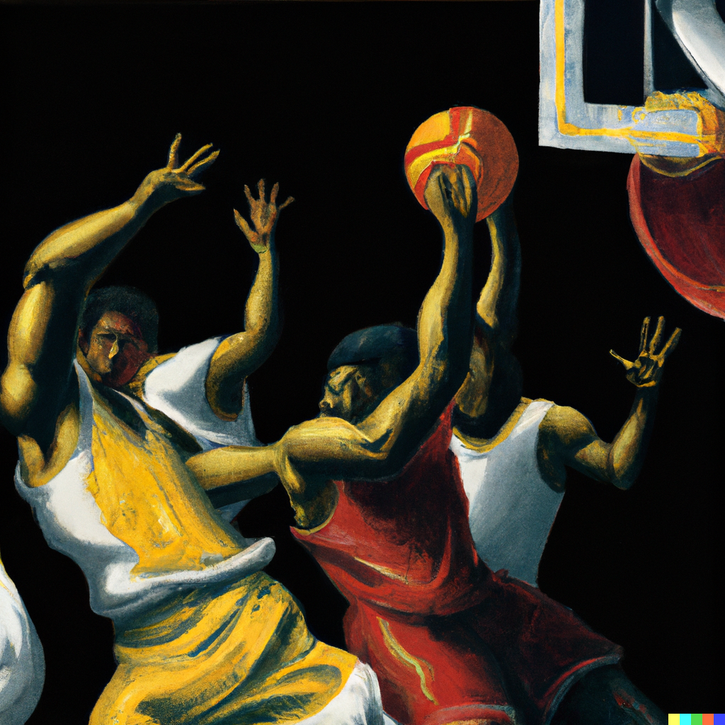
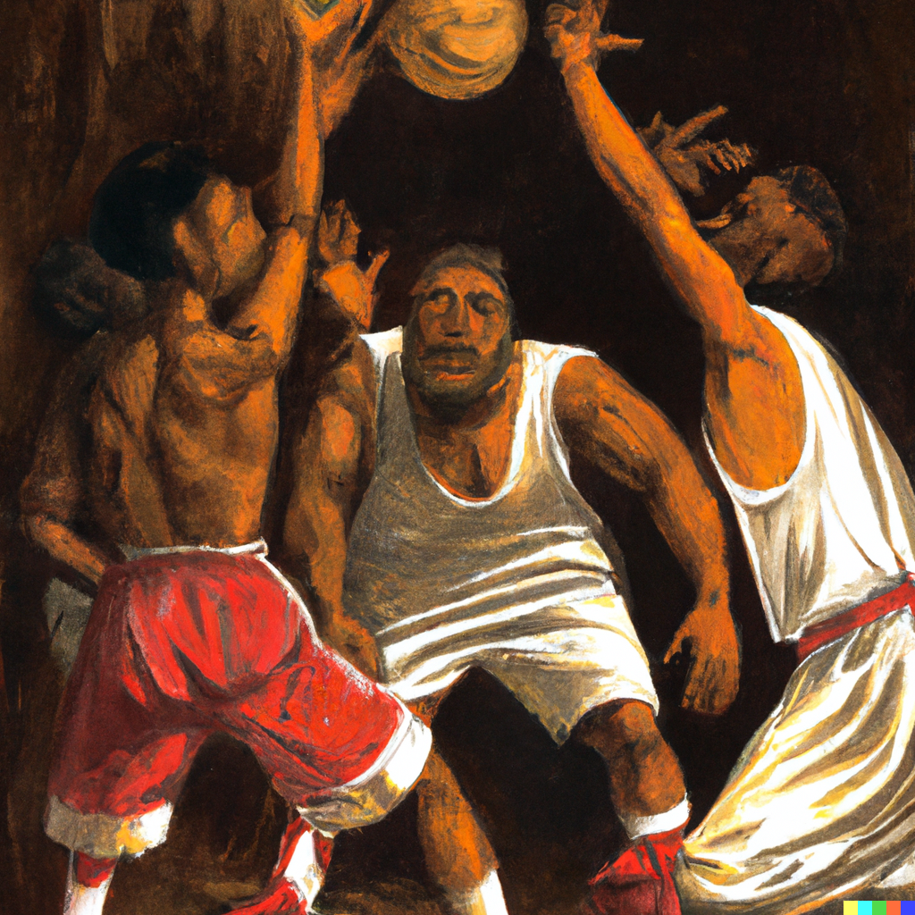
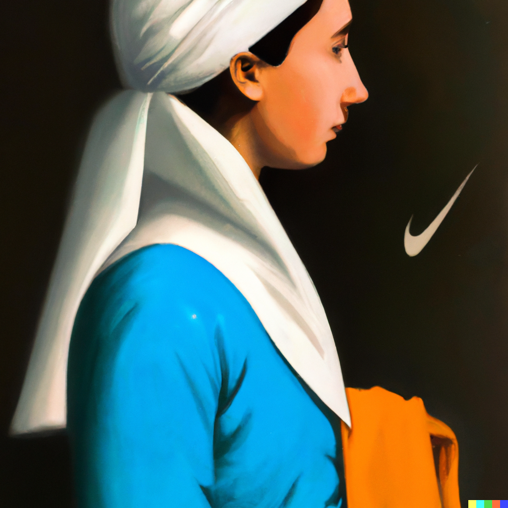
Ok so these first ones were “Caravaggio painting of basketball game” and then “Johannes Vermeer painting with Nike logo”. I’d say the first two don’t look like Caravaggio lol. The last is more of a fan art of a Vermeer, but the logo came out nicely.
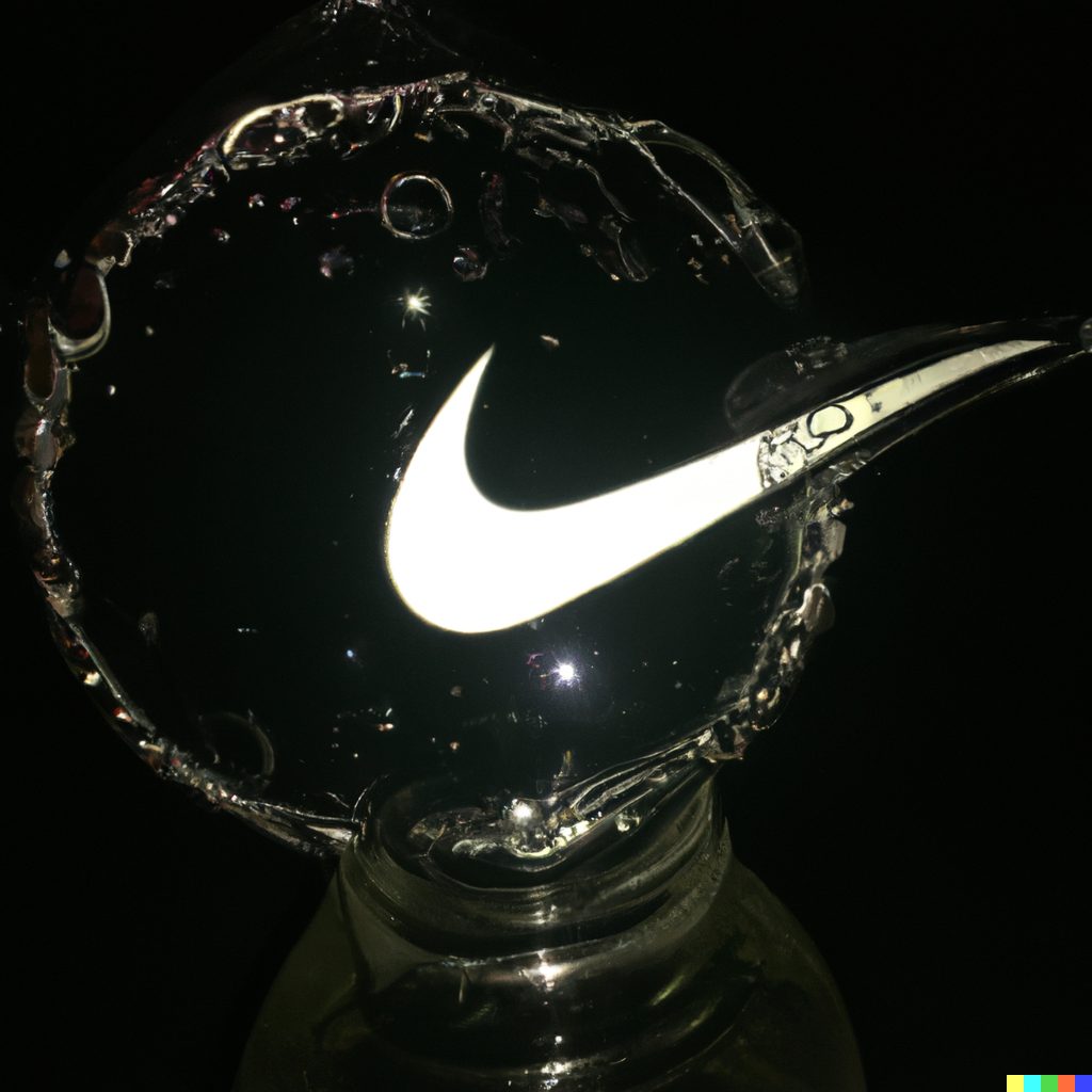
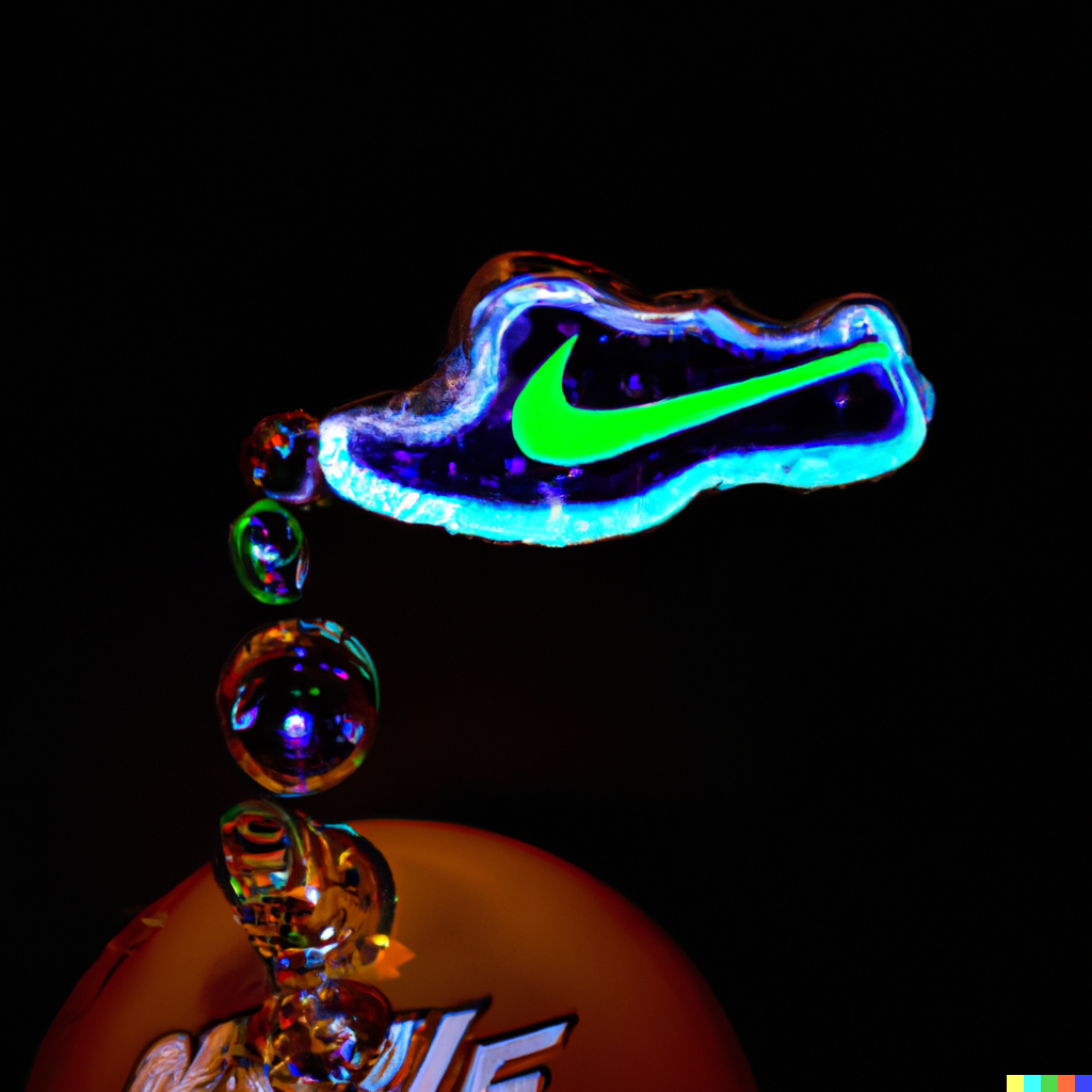
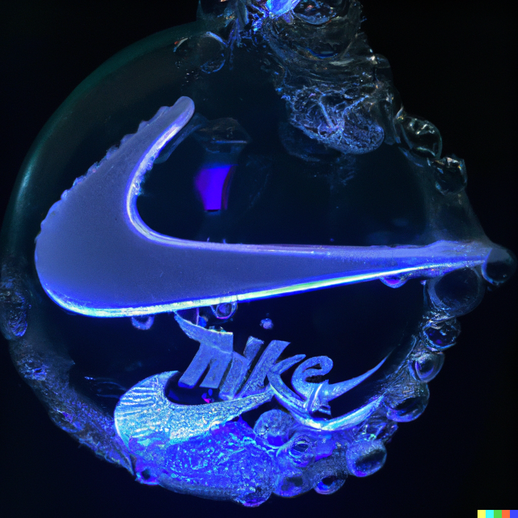
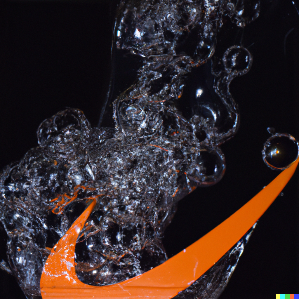
These last ones were “glass blown bubbles with Nike logo”. What’s crazy is I was trying to mimic images from @nandocosta here. So essentially, I’m using AI to try to grasp at another AI image that was already produced. This is where I formed more ideas about how to use OpenAI’s tool. You can’t just plug and play, clearly @nandocosta’s line of text he used to generate his work was much different than mine. This just brings to mind a lot of ideas of how to phrase what I’m looking for now.
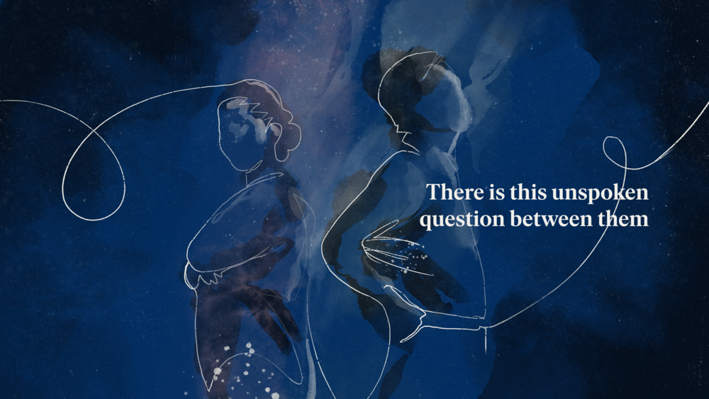
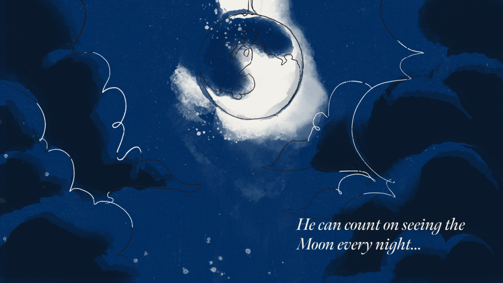
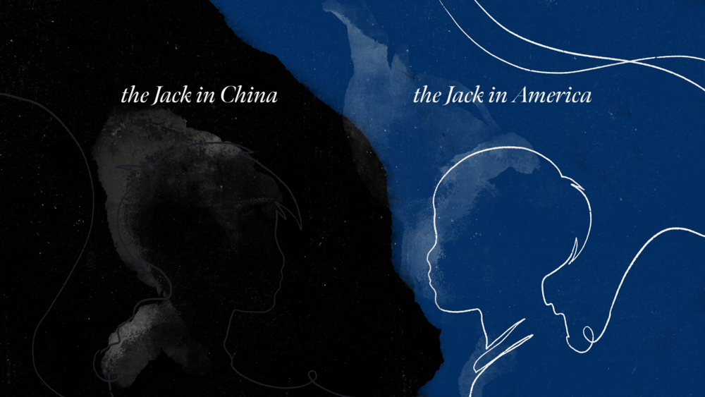
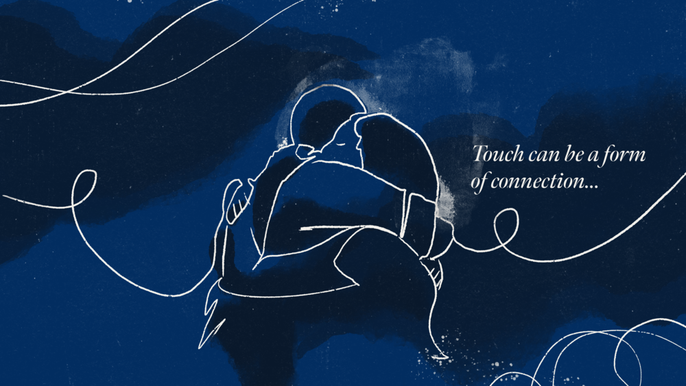
In their own words, “When a good book ends, the conversation begins.” The folks at BookClub reached out to me to create some motion visuals for their first round of books at the launch of their site. What we collaborated on became some short vignettes that visualized author Simon Han’s discussions on his book “Nights When Nothing Happened”. We wanted a dreamy, organic look to mimic the emotional struggles covered by the author in his bookclub discussions.
Although you’ll have to join BookClub to see the actual motion pieces, I’ve added some initial keyframes below. After watching his entire discussion and digging into what I could on the book within the contract’s timeframe, I decided to animate a continuous moving line over organic textures to literally draw together the imagery. This felt like an accurate way to show ideas being discussed.
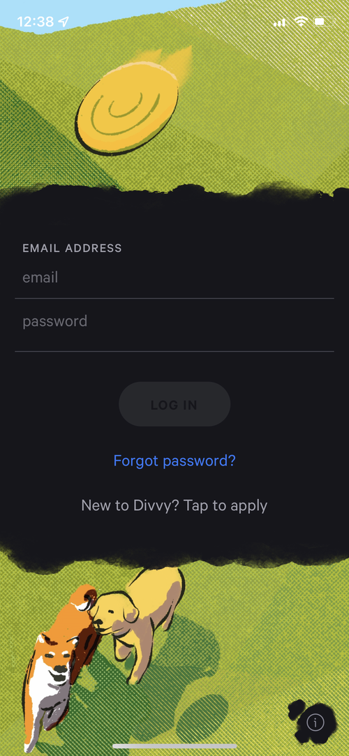
Divvy releases a free ebook every so often. We designed this one a bit differently. The idea of a virtual card brought up some “cyberpunk” inspiration. I was able to draw the illustrations and design this ebook also. You can download the whole thing, but I just gotta grab the link, lemme go find it...

Small update, we moved out of UT. We’re currently on PST time in Wenatchee, WA.
In May we’ll be in Boston. July we’ll be in D.C. and in September we’ll be in NYC.
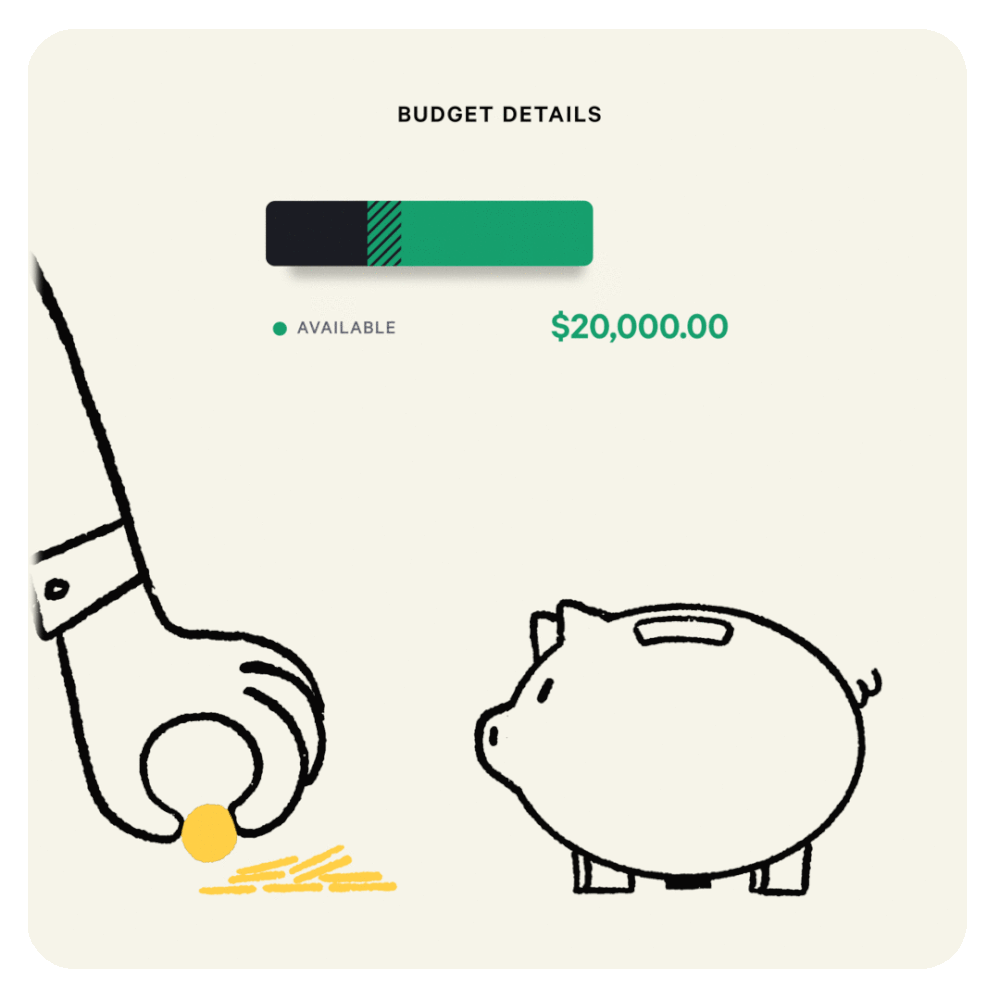
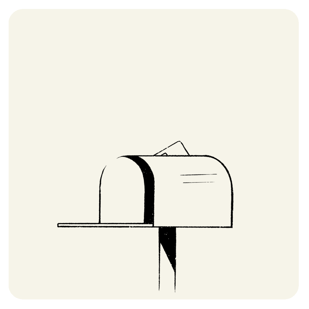
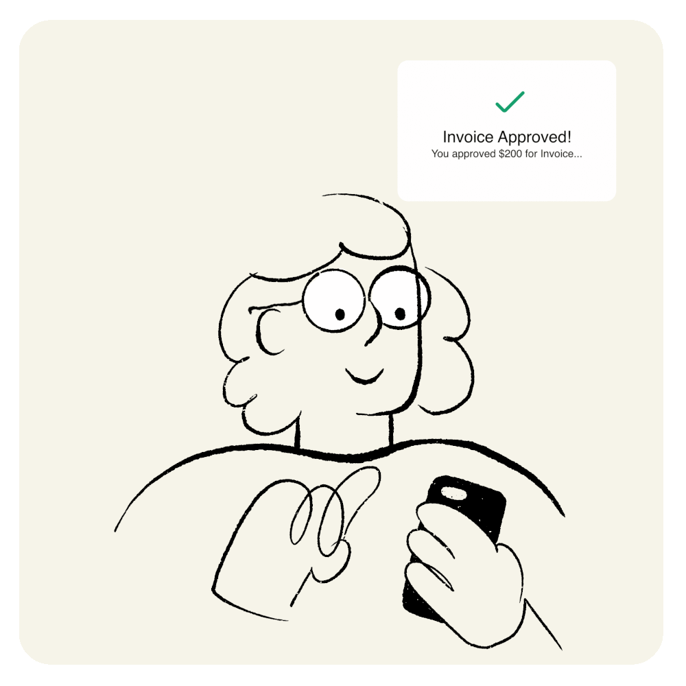
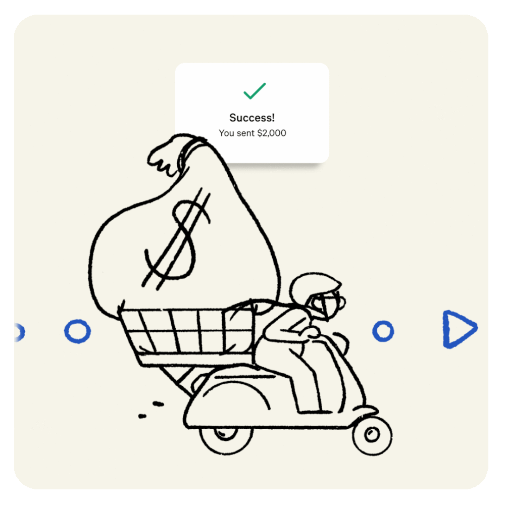
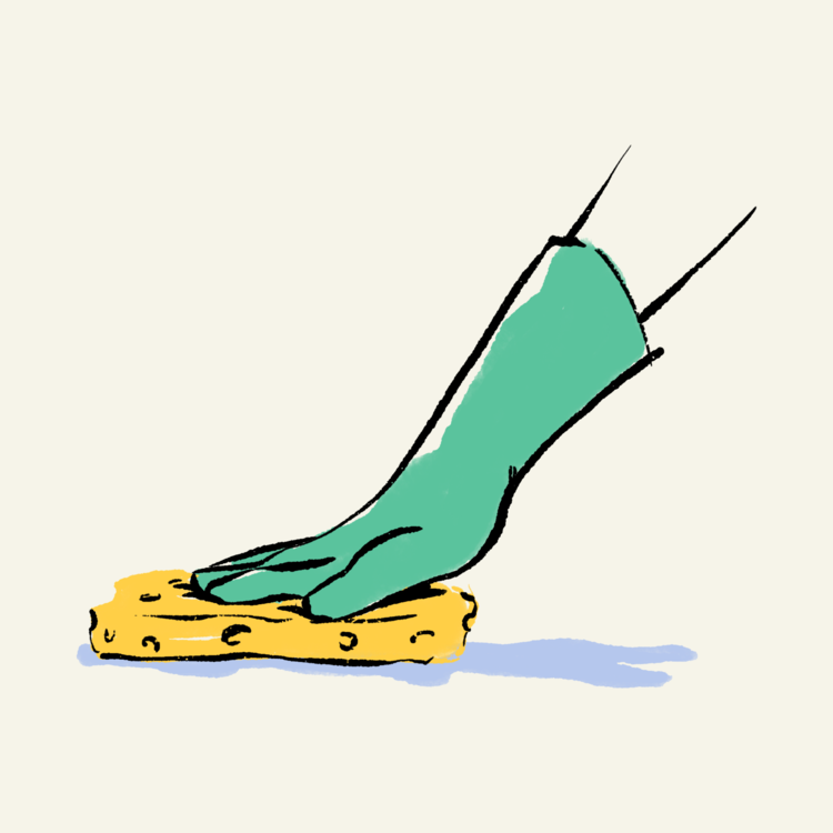
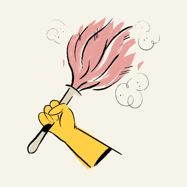
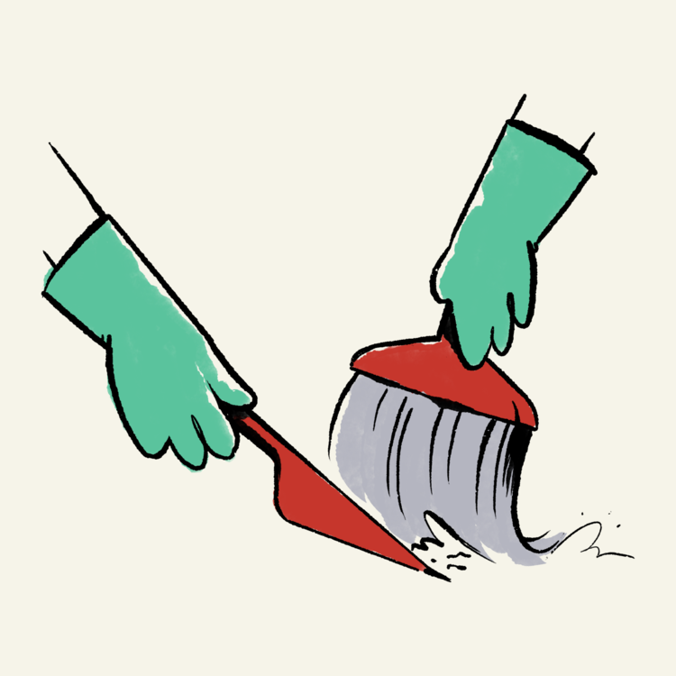
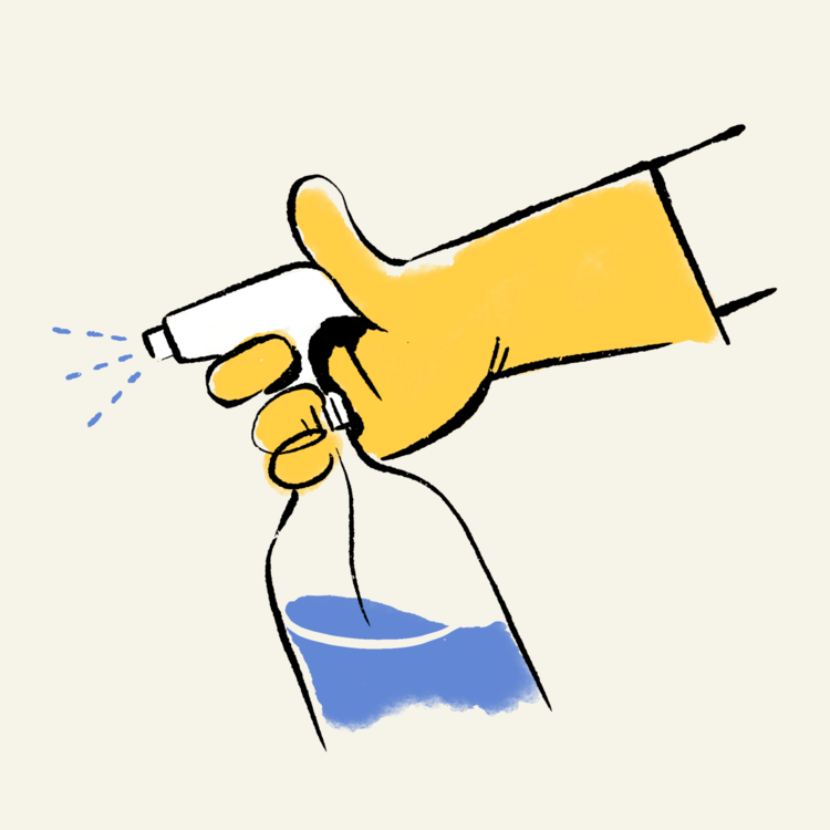
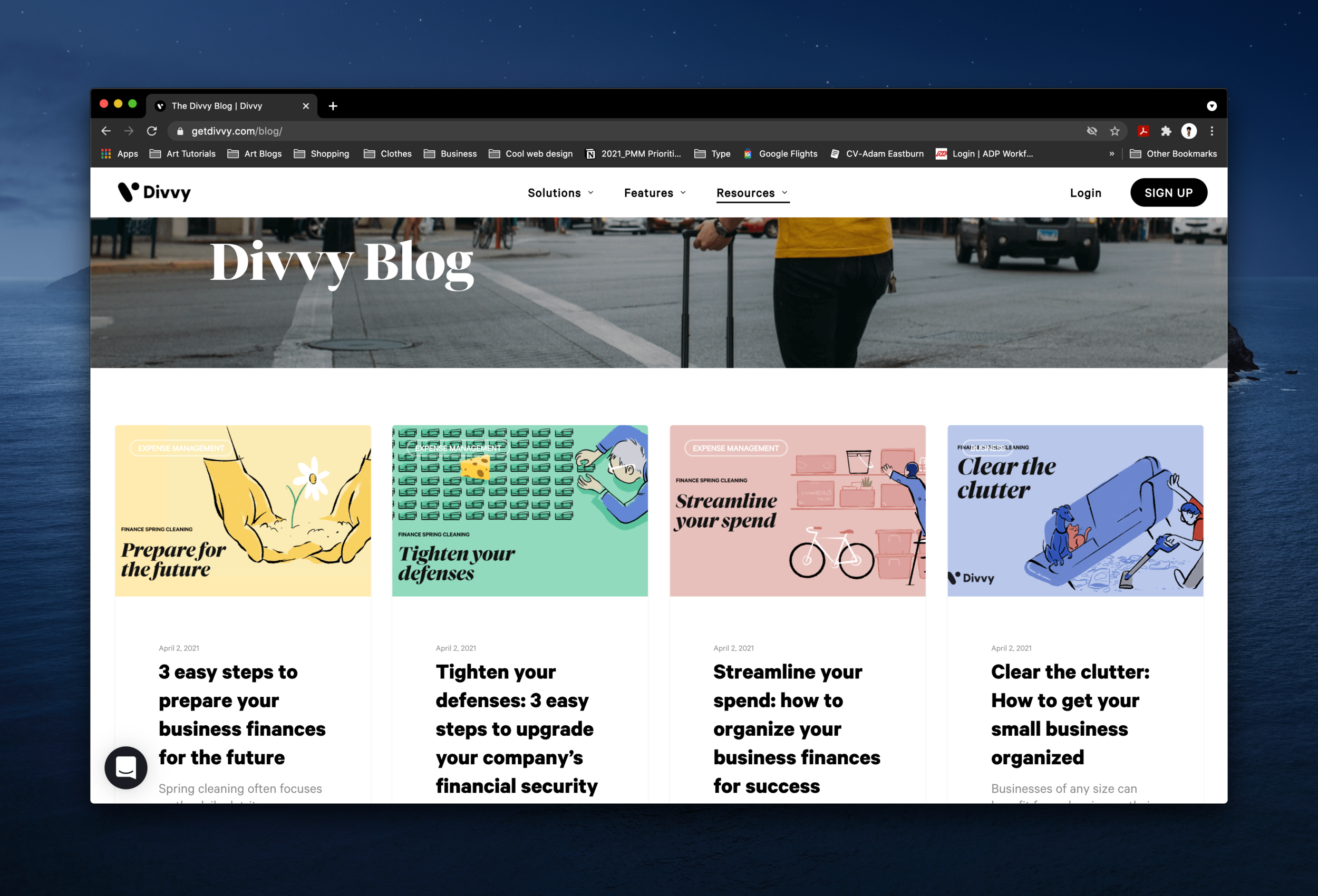
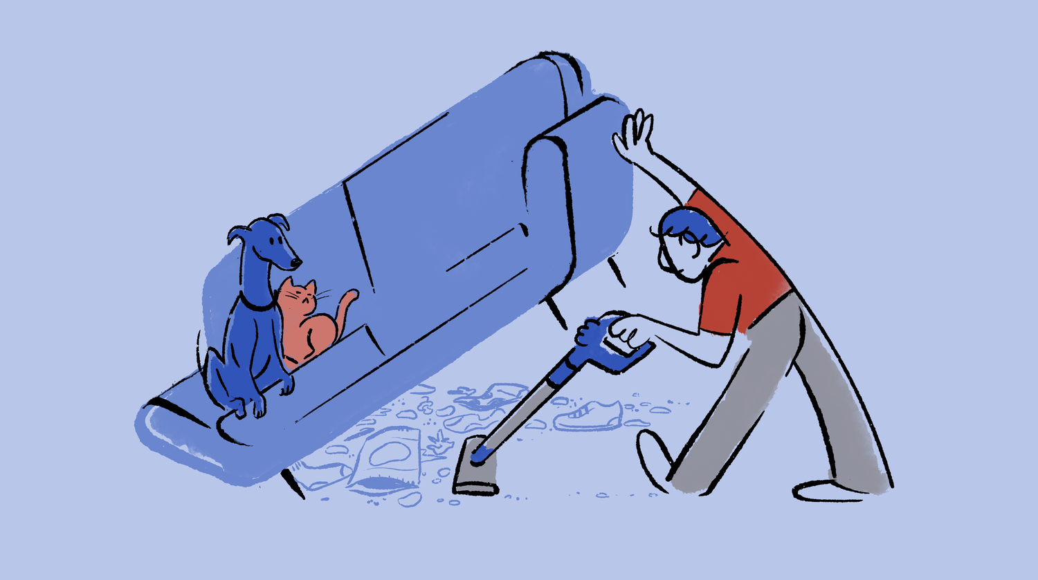
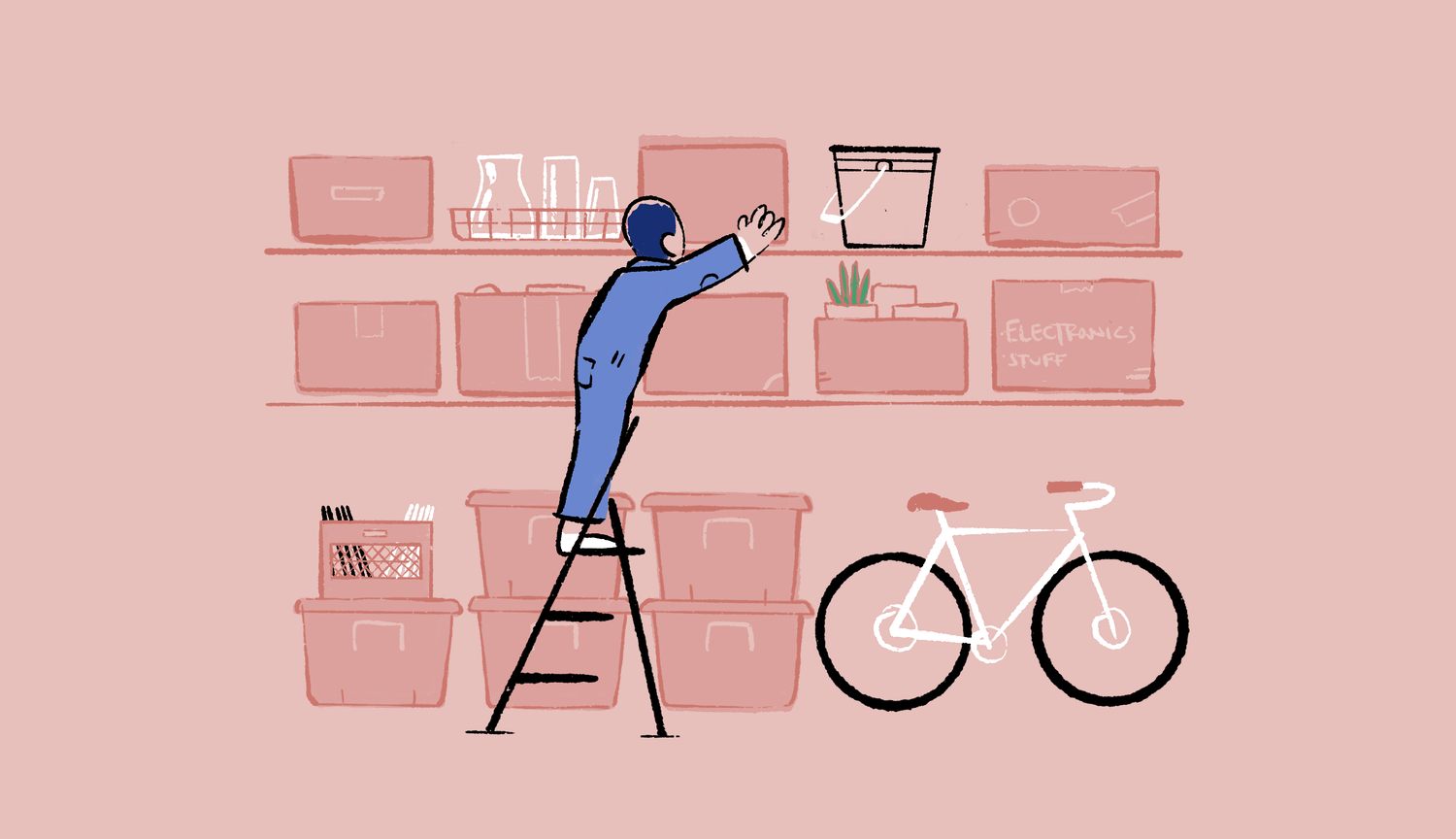
We did a Divvy “spring cleaning” campaign abt getting your finances in order. It included blog posts, social posts, and ebooks. These illustrations were used for that:

In 2019 we did a campaign in Arizona, so I created a few pieces that were more local. This piece of Camelback Mountain existed somewhere on social and a billboard:

At the beginning of COVID, everyone was cranking out WFH imagery. This was one of many:

This illustration was done at the beginning of 2021 and featured around the office at Divvy HQ. I wish I had made the character taller and more proportional.

This is one of the first gifs I made for Divvy back in 2018.

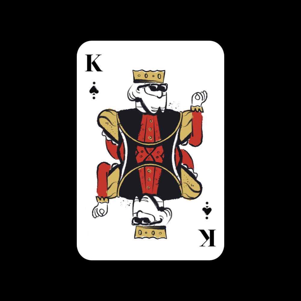
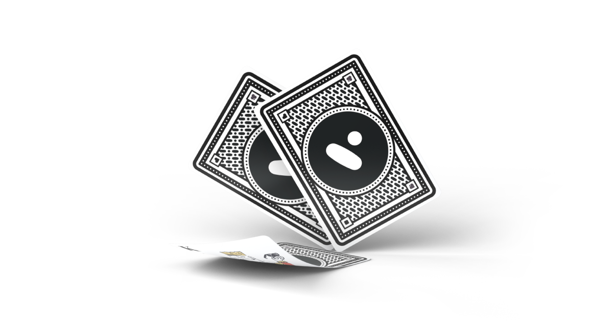
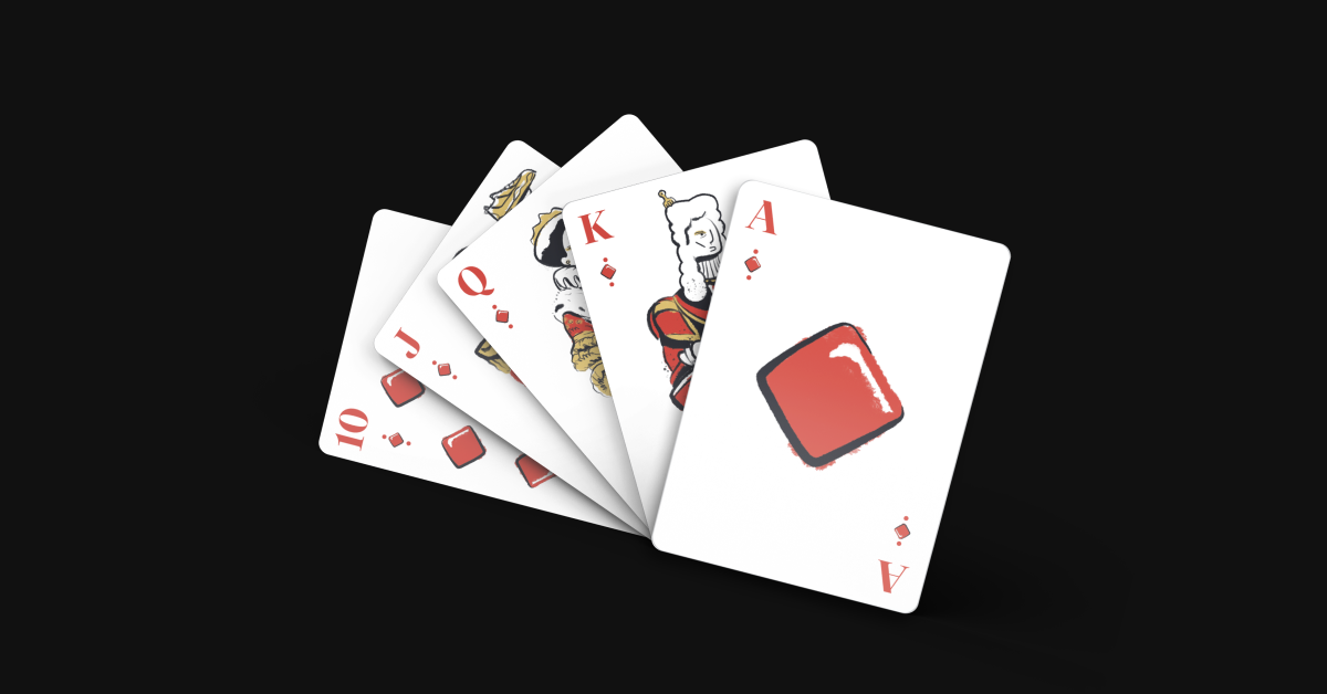
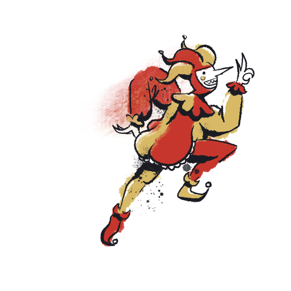
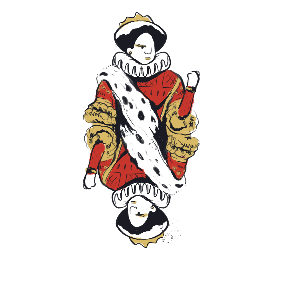
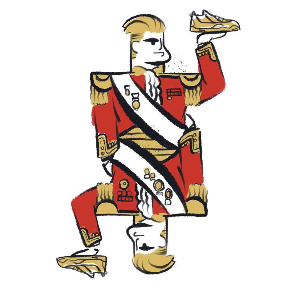
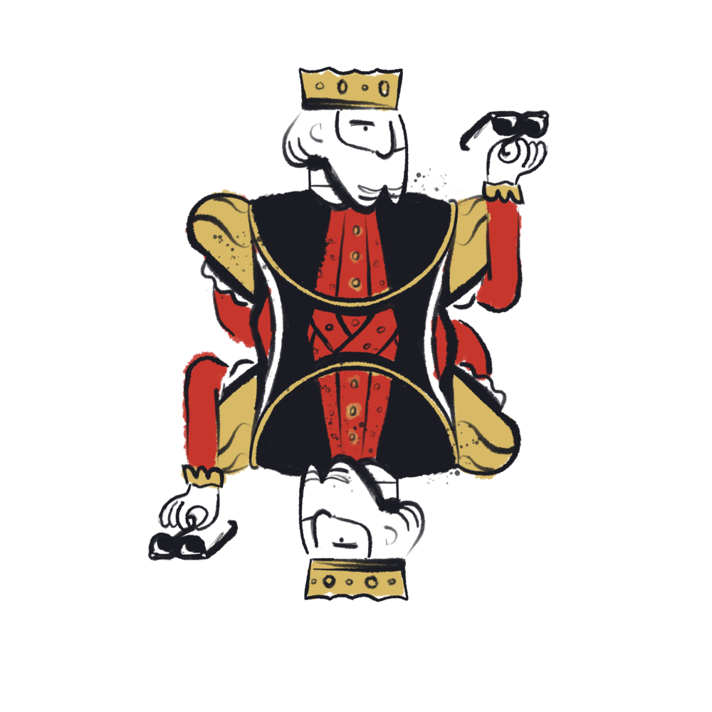
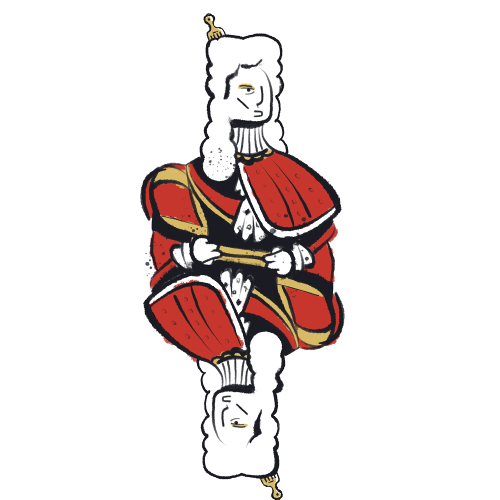
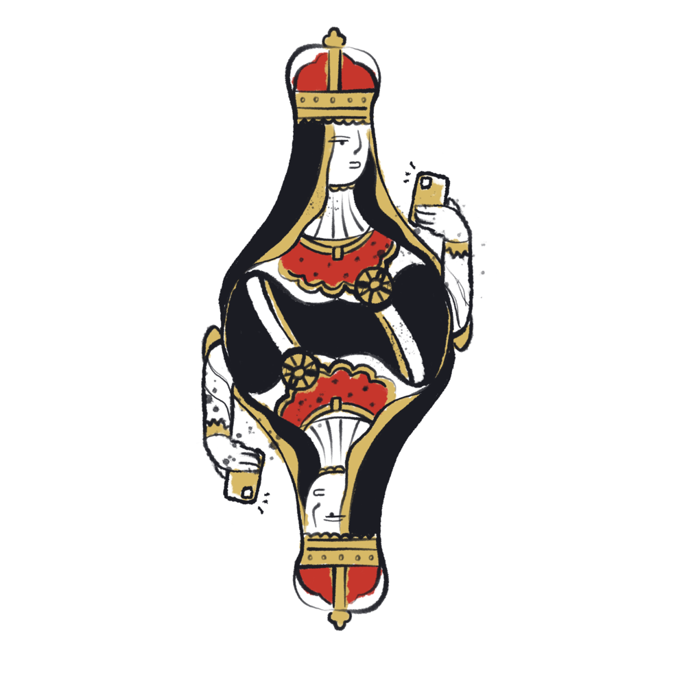
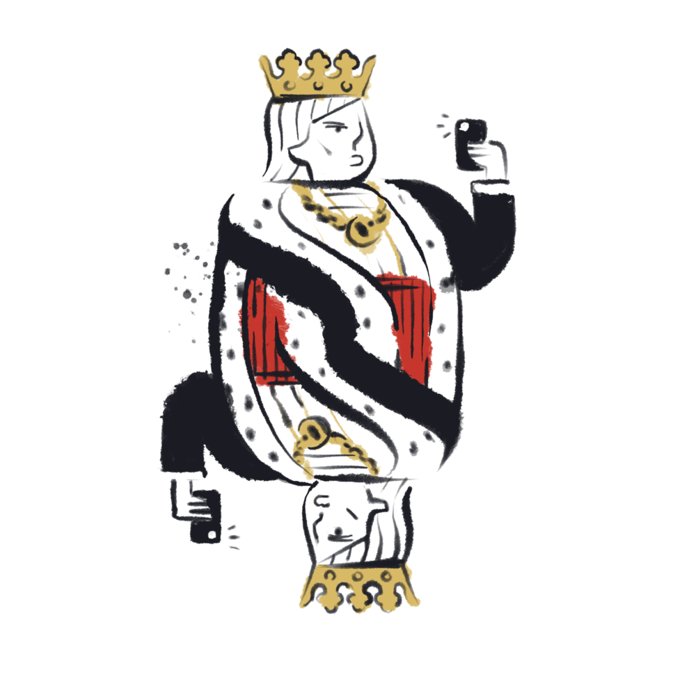
In 2019, we made a full deck of cards for a Divvy swag item. They were part of a larger casino night event that involved some fun design.
I’ve never been to this site but apparently they featured one of Divvy’s mobile screens and it had an illo on there that I’d made:)


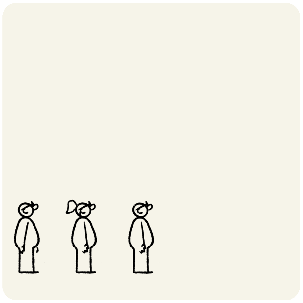
A little pit crew. This was used sequentially to aid some sign-up form screens.

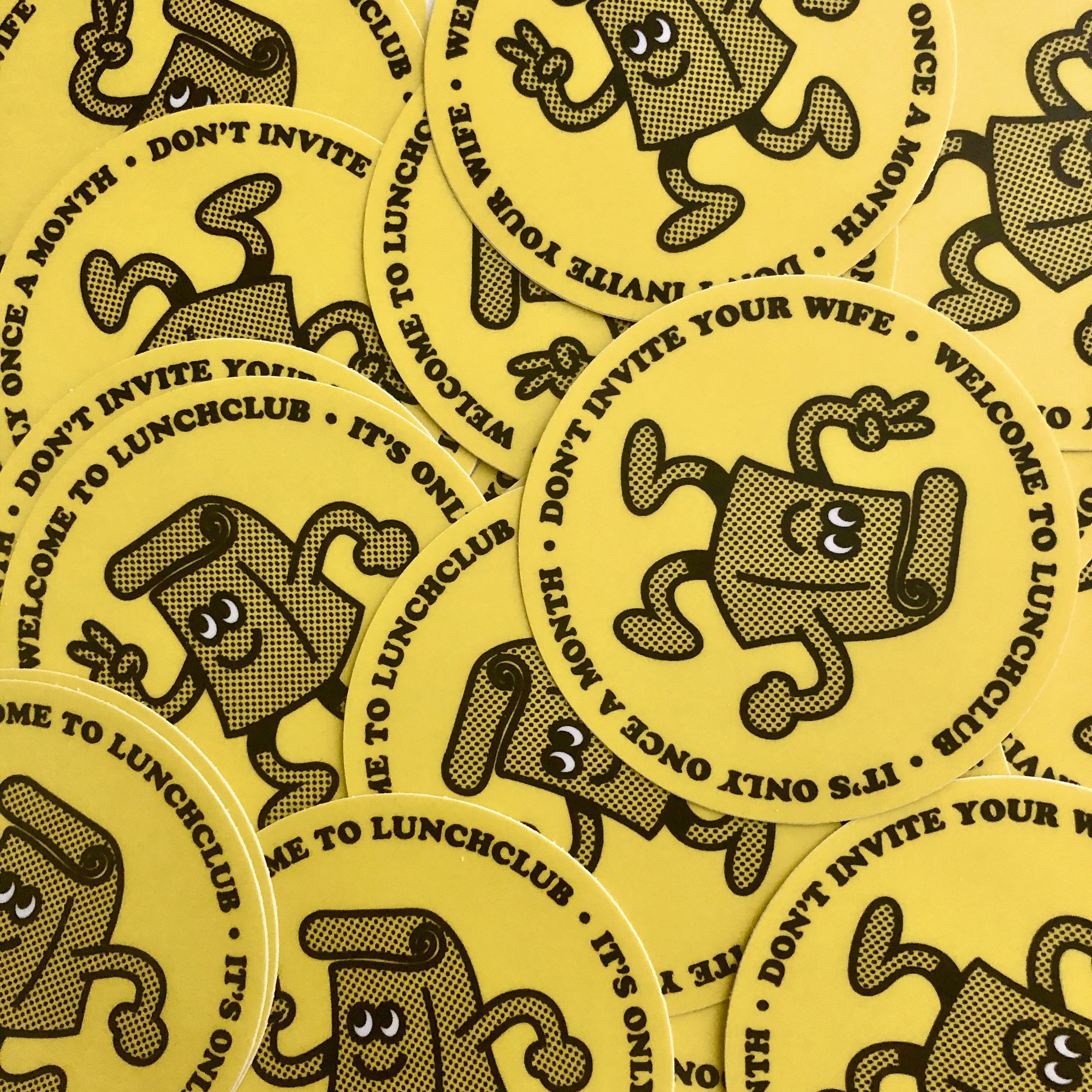
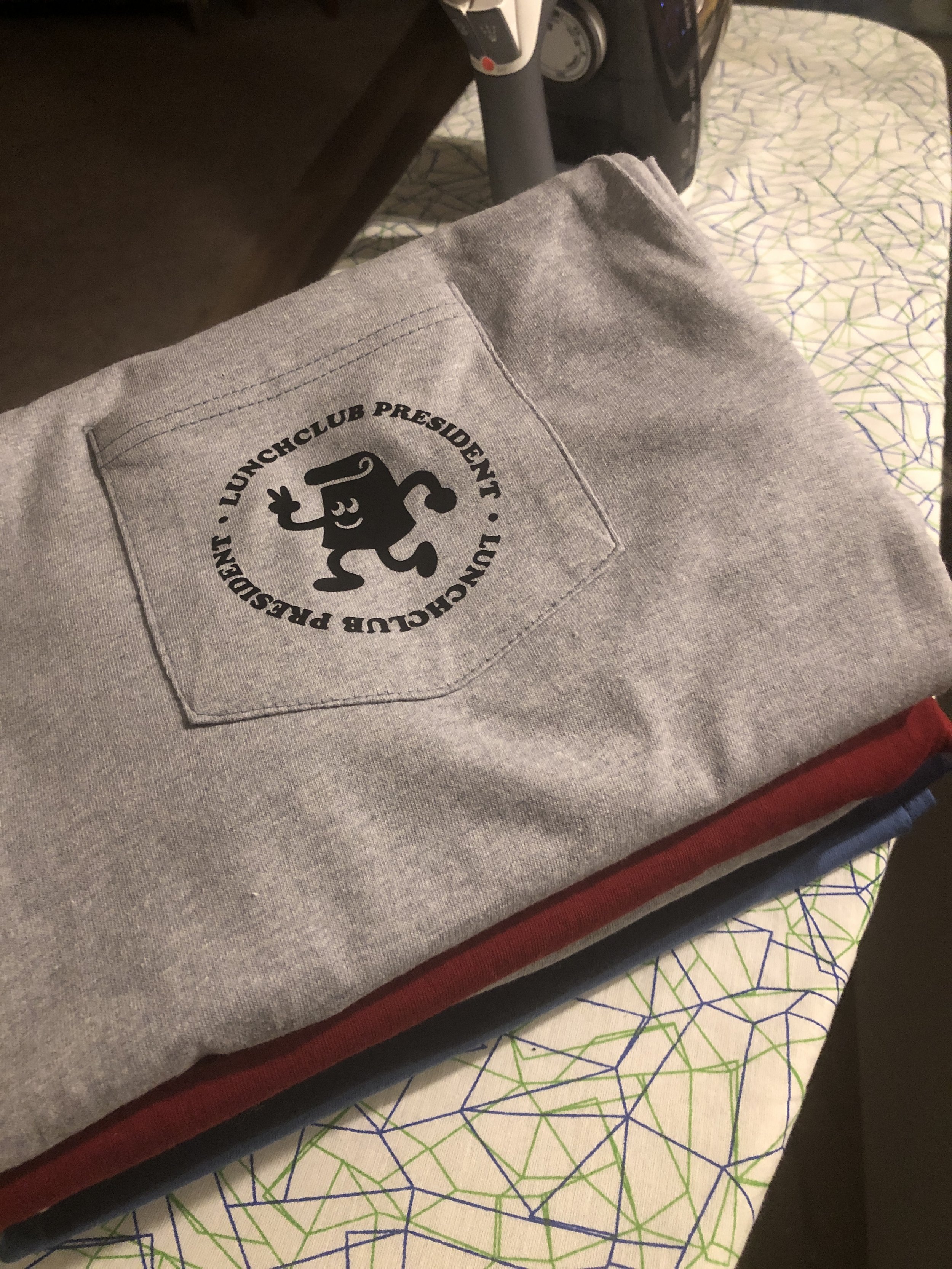
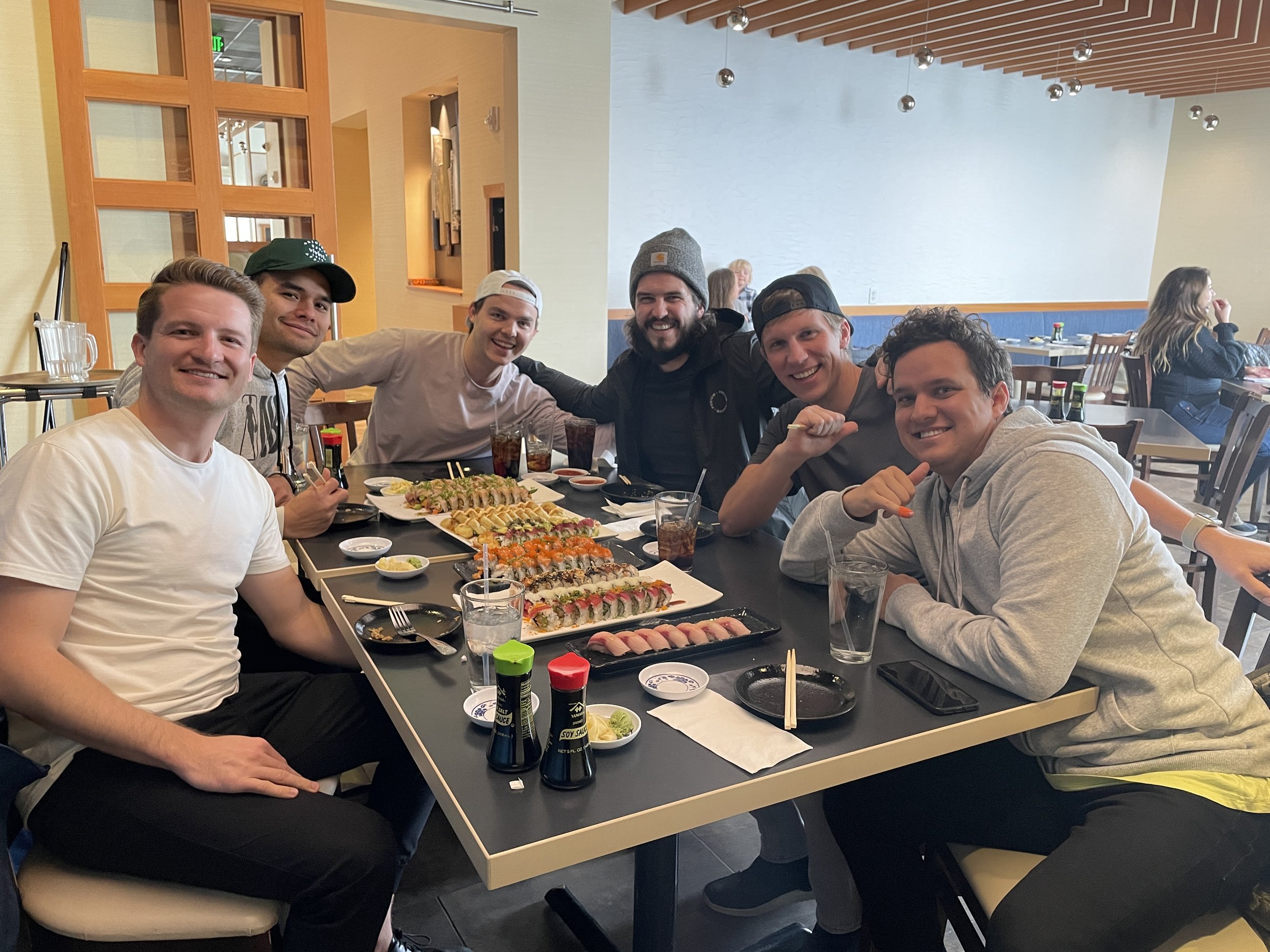
During 2020 peak COVID in UT, I connected up with anyone who was WFH in our neighborhood. We did our best to communicate and stay sane amid the chaos. This year, as restaurants began to open up dine-in again, we began a monthly lunch group. We did our best to invite new people every month and pick a spot. Since the WFH-ers were predominantly men, we made some silly boy rules in “Fight Club” fashion, which included not inviting our wives to lunchclub. Really, we were just jealous at how many parties moms/our wives threw.
I made some fun pieces, including a little logo, for Lunchclub.
Another video to retire here. This was my first attempt at a longer form video(longer than a social post) that had typography as it’s main animated design element. It was a lot faster than animating UI or illustrations, and it was way clean.
The backbone of all of these videos is the music track. You can have the fanciest animation but it is doesn’t slap to a beat, it sucks lol. This one is closer to the music track but the majority of the Divvy stuff doesn’t get enough time for me to time it out right.
All music for Divvy stuff is sourced by a local studio, and I love ‘em: https://pleasantpictures.club/